Reimagining self-service for 15.3K weekly active customers
A deep dive into improving how customers find and access key tools, bringing value, personalisation and transparency to their online shop.
A deep dive into improving how customers find and access key tools, bringing value, personalisation and transparency to their online shop.
Areas
Strategy, Research, Design
Who
Woolworths · 2025
Tools
Adobe Analytics, Askable, UserZoom, Figma
Platform
iOS, Android
Yet Woolworths received over 345,000 calls in 2024 regarding account and self-service-related problems. While some of these problems can only be solved by human intervention, there is still a massive opportunity make it easier for customers to self-serve. An opportunity in the millions.
Despite having a large suite of self-service tools and information, Woolworths makes it hard for customers to find and use them, especially in moments of frustration.
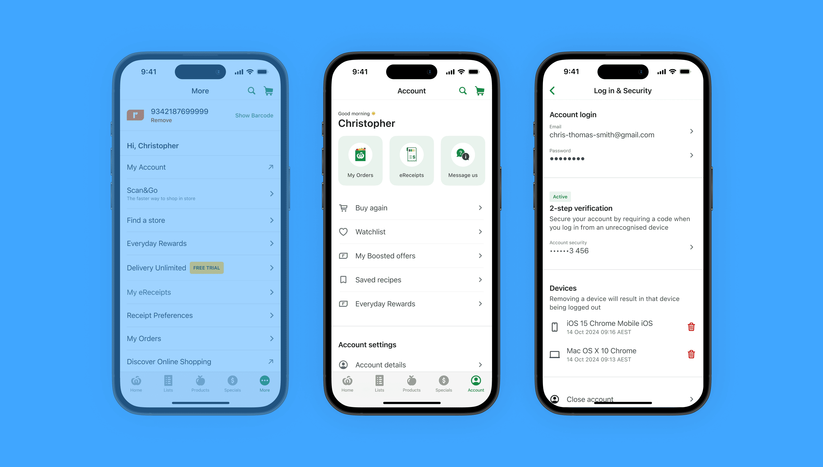
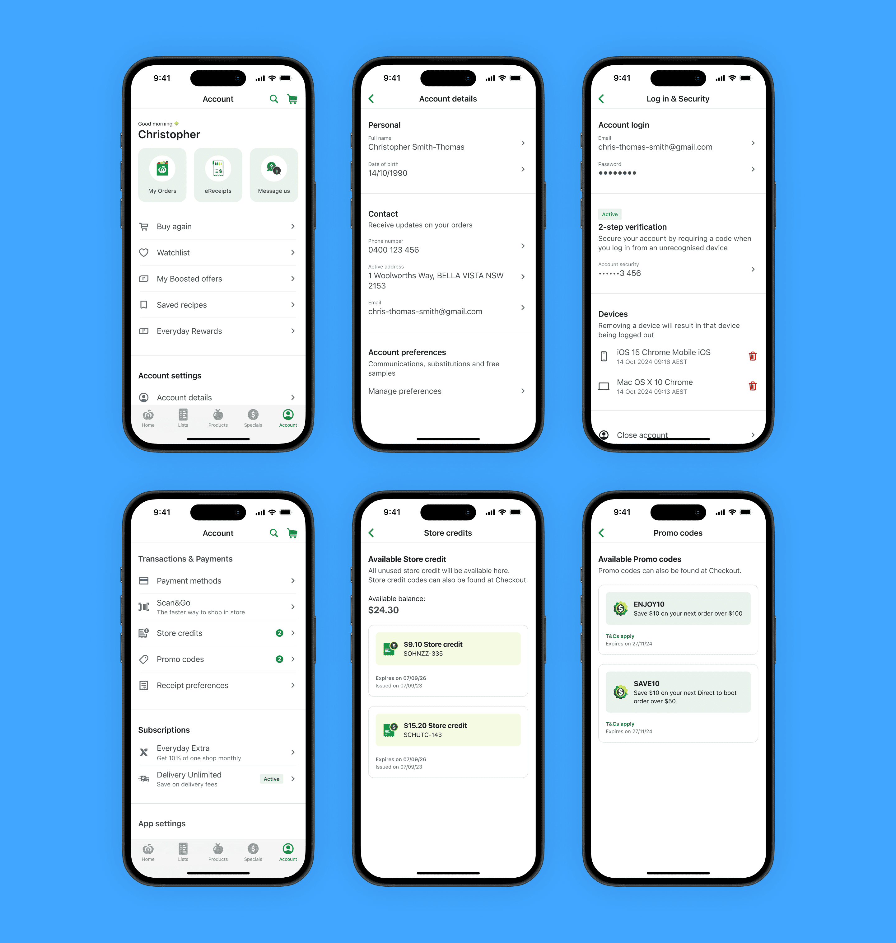
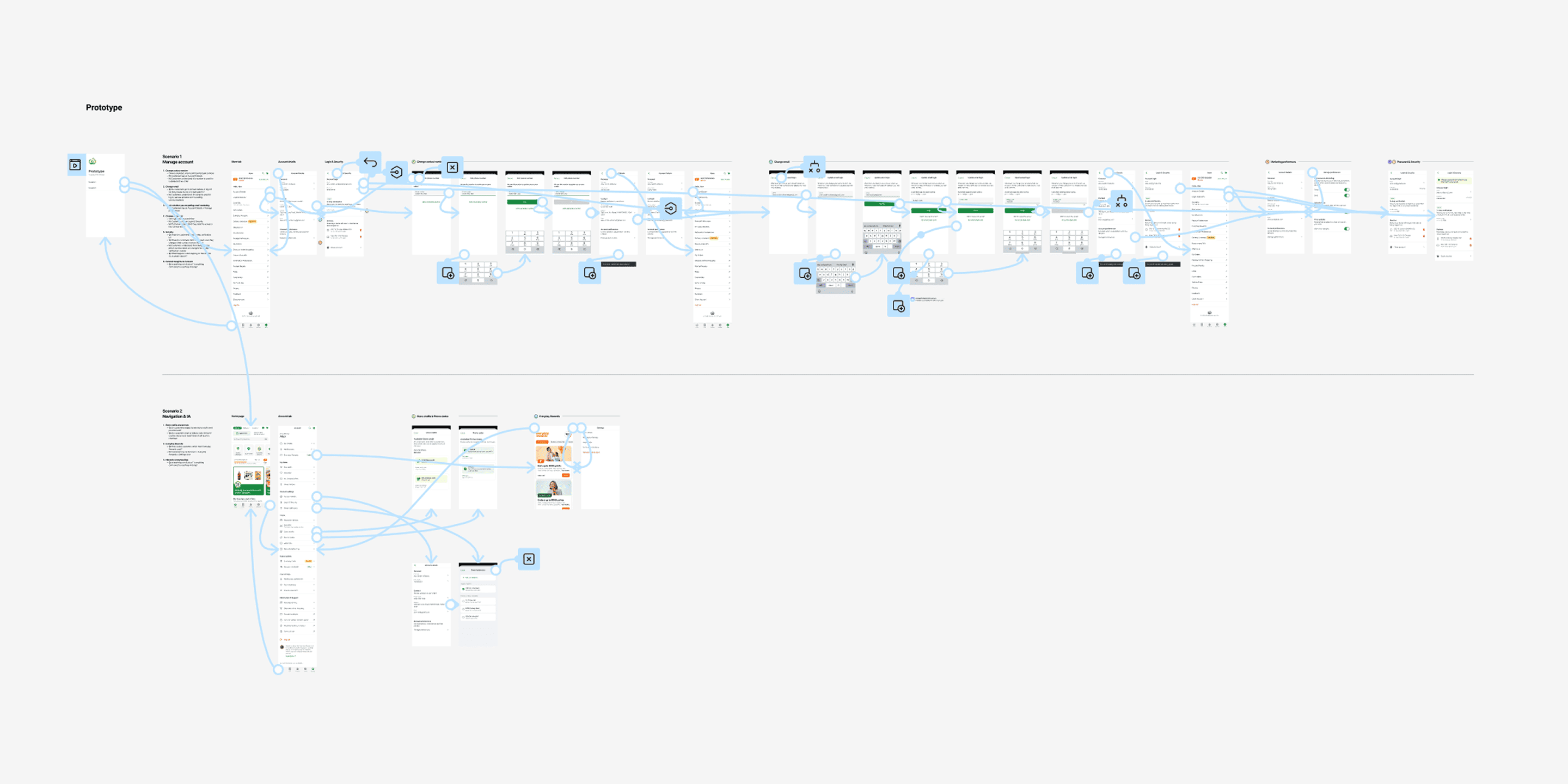
A foundational account hub that provides a seamless, secure, and intuitive experience for management of personal details, preferences, order history, payment and app security, all in one place.
decrease in account-related calls
saved in cost to serve
increase in engagement to My orders
I identified 16 teams that would be impacted by changes to this experience, and mapped them against a matrix to determine how to involve them in future feedback and roadshow sessions.
I spoke to customers, analysed verbatim and support call logs, and conducted a heuristics analysis.
Key problems
Lack of personalisation
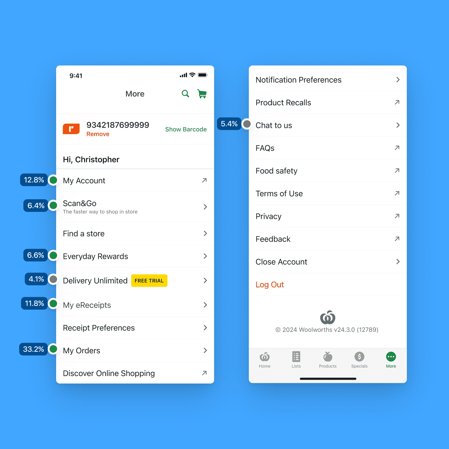
Customers spend additional time trying to find information or features that are relevant for their needs. Stakeholders view this screen as a way to bring more visibility to their features, but has an opposite effect as more links are added.
Poor hierarchy and findability
Customers feel overwhelmed and lost scrolling through all the links. The current hierarchy does not reflect how customers use the menu, or the natural groupings of tasks and information.
Disjointed omni-channel experience
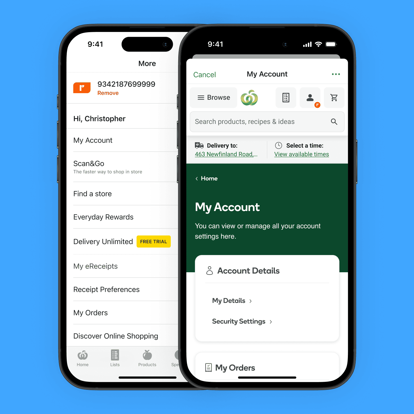
To access account information, customers are pushed into a different, WebView experience. Customers end up continuining their shopping experience in a buggy web view.
Increase More Account menu interactions
By strengthening the brand of More -> Account, creating a place for all things personal and account-related.
Increase engagement of self-service features
By improving findability through increasing visibility and bringing meaningful structure to all self-service features.
Reduce overall Customer Hub costs
By making features and information more readily available, and bringing prominence to asynchronous support channels.
Improve app adoption, VOC and NPS
By making it easier to access information and manage personal details and security natively.
I used two primary methods to determine what customers used the account for, which would later be validated as part of testing.
Analysing Adobe Analytics & FullStory
To understand current customer behaviour, I leaned on existing data we had in Adobe Analytics for web and app, and FullStory for web.
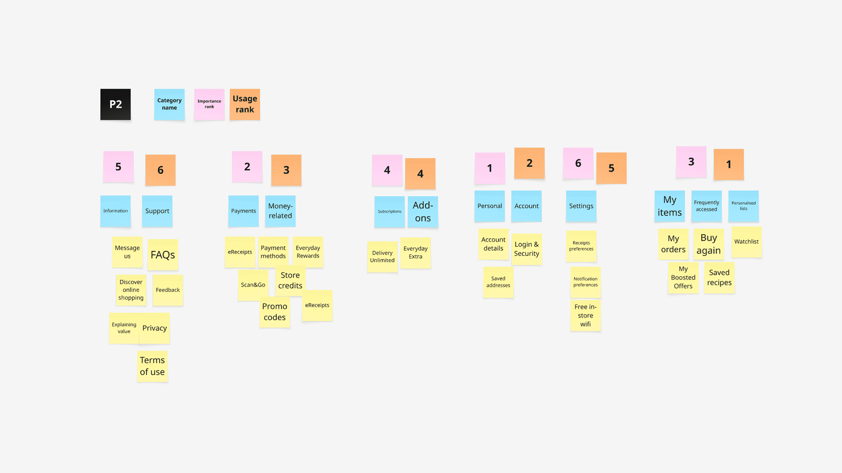
Card sorting
As I also looked to introduce new entry points within the account section, card sorting was performed in moderated sessions to better understand how customers grouped features and information.
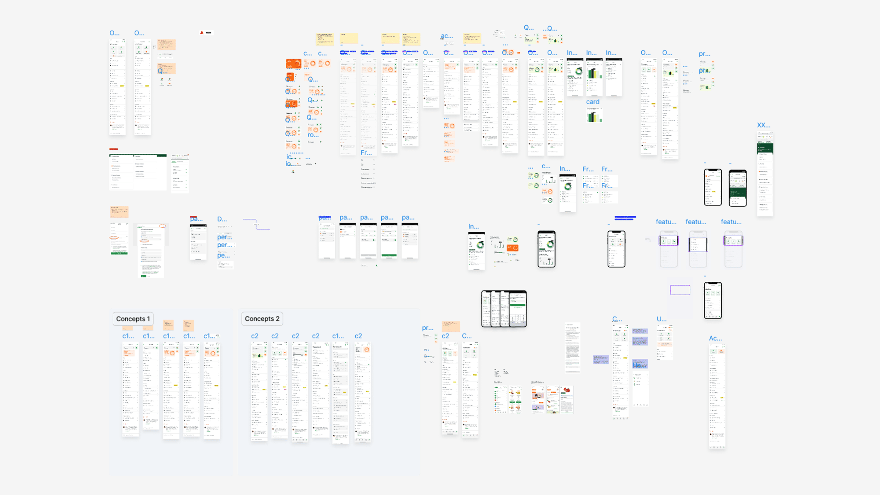
After ideating and a round of feedback with stakeholders, I facilitated customer sessions to validate the information architecture, usability and comprehension of the Account tab.
Key insights
I presented back the overall My Account strategy to senior stakeholders, showing how the new experience would bring value to the business and customers.
One thing I reinforced with stakeholders was that while this work directly addressed the problems identified, it was also foundational in enabling the future goals of Woolworths around personalisation, bringing more value to customers, and becoming best-in-class.
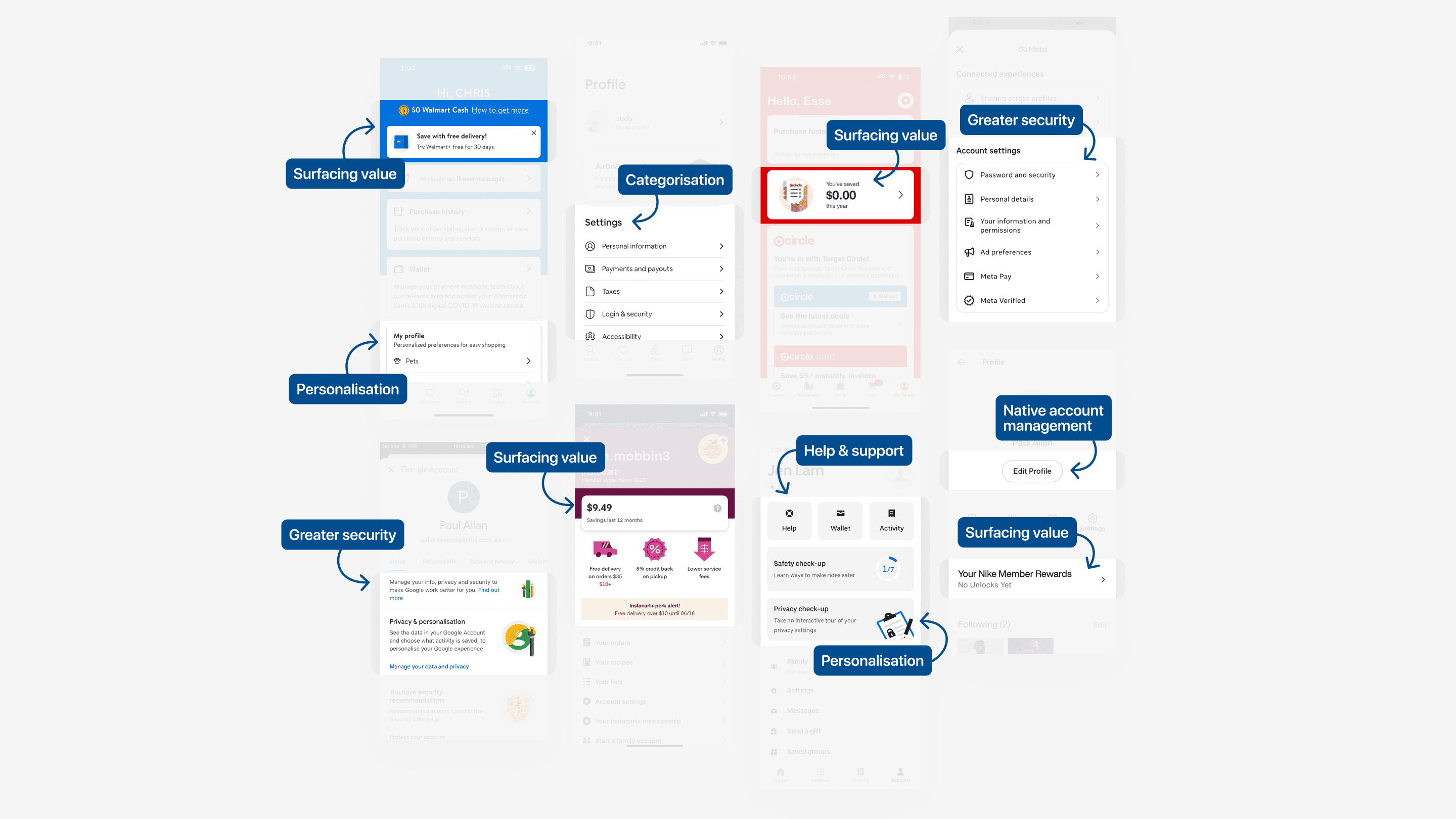
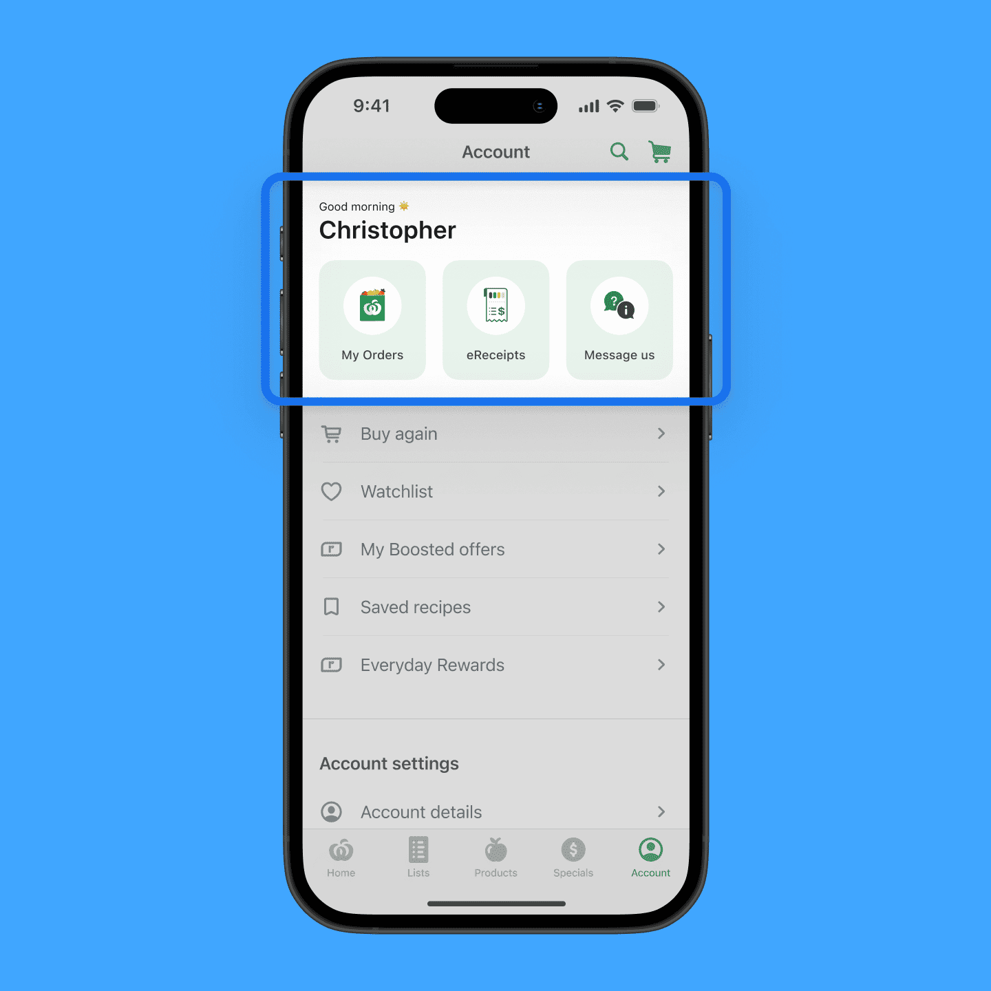
Quick links based on customer top tasks, elevating support, and creating richer visual cues.
Customers found it useful to have their most accessed links readily available. In particular, forms of support previously felt 'buried' and 'hidden' from customers.
Problem addressed: Lack of personalisation, Poor hierarchy and findability
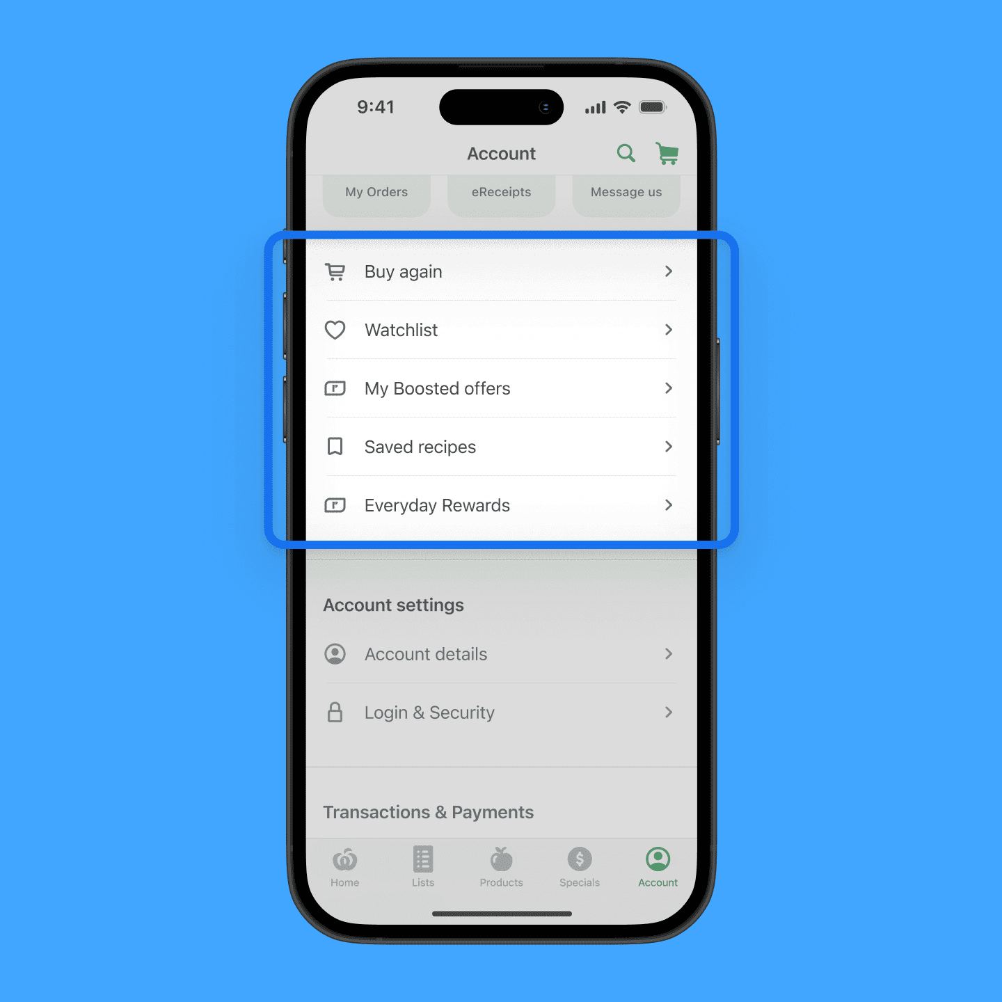
Personalised and curated content in a centralised place.
Customers found it easier to access these links, as opposed to traversing different screens on the app to find their curated items.
Problem addressed: Lack of personalisation
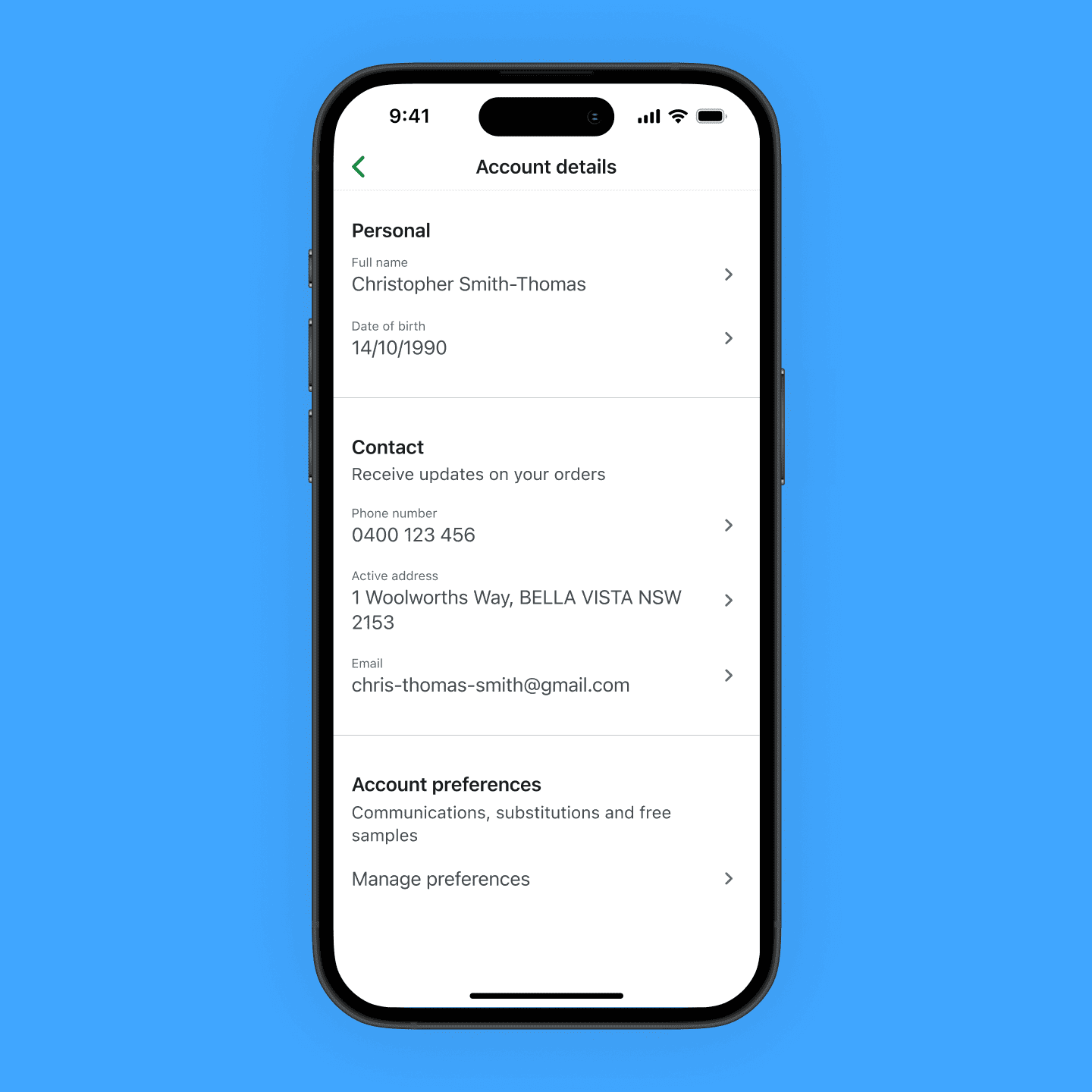
A seamless native experience for the management of information and security.
Customers previously had no way of managing this information natively, and found it quick and easy to make updates to their account when doing so natively.
Problem addressed: Disjointed omni-channel experience
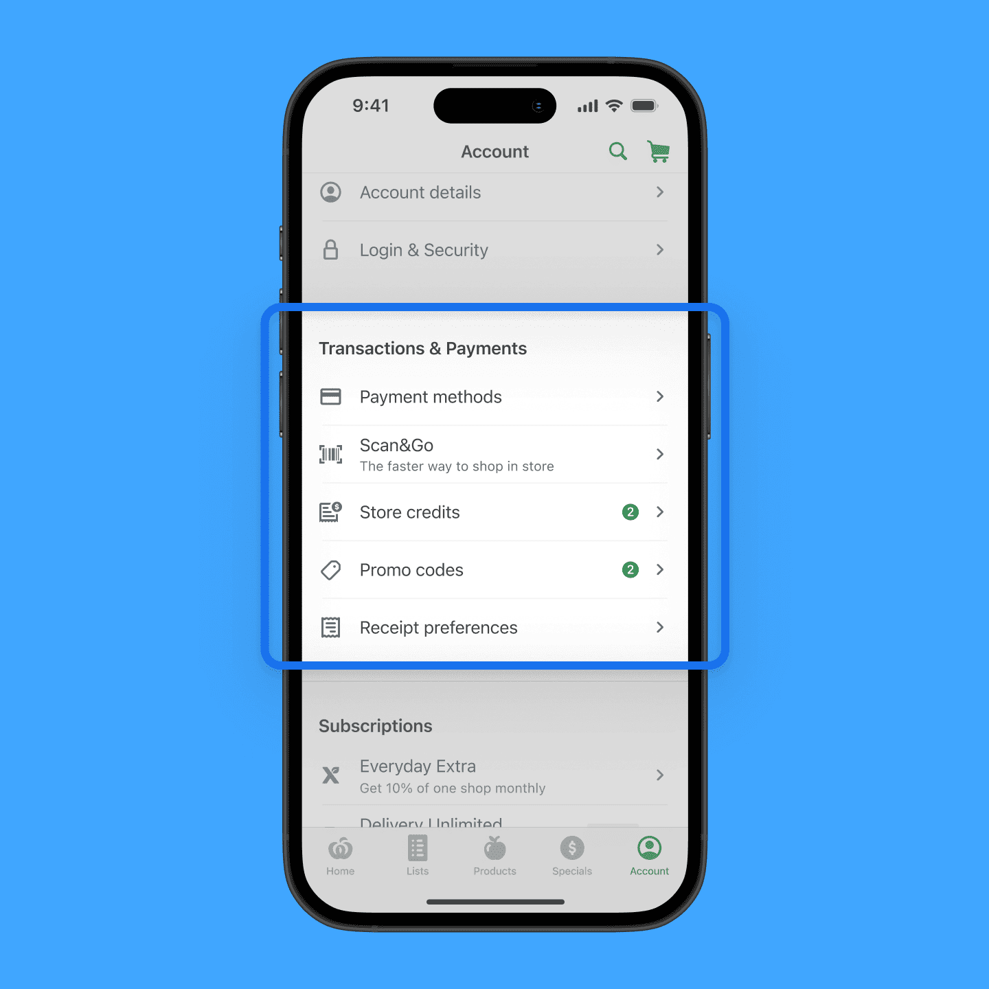
Surfacing financial controls and information in the form of payment methods, store credits and promo codes.
Customers previously could not access or manage any of these features natively. Seeing credits and code upfront would positively impact budgeting and spending habits.
Problem addressed: Lack of personalisation, Disjoined omni-channel experience
I appreciated that this initiative had reliable, existing data to work with and help inform design decisions. I had also previously worked in the authetication space within Woolworths so much of the log in and security work was familiar and I could lean on my technical understanding to make decisions.
A challenge I had encountered, which is not as common in other spaces in Woolworths, was trying to quantify the value to senior leadership. As a section in the app that does not directly generate revenue or impact sales, it was hard to attach a dollar value and demonstrate that this initiative should be prioritised. I managed to work with Customer Hub and Finance to understand the financial impacts of certain features, which helped with my financial analysis and pitch to stakeholders.
Ultimately, this initiative was a good opportunity to work more closely with the business, pitch a strategy deck, and get buy in to proceed with building out this experience.