Helping customers change their orders post-checkout
A deep dive into redesigning how customers make changes to their order fulfilment method, timeslot and products.
A deep dive into redesigning how customers make changes to their order fulfilment method, timeslot and products.
Areas
Research, Design
Who
Woolworths · 2024
Tools
Adobe Analytics, Askable, UserZoom, Figma
Platform
iOS, Android, Web
Yet many Woolworths customers face uncertainty when going through this process, often resulting in them abandoning their changes. In 2024, there were over 100K calls regarding cancelling or changing an order, costing the business over $1.1M to service.
Every abandoned order amendment is a potential lost sale for the business, and an unhappy customer who will not receive their perfect order.
A task-driven experience to help customers make the exact changes they need to complete their order.
reduction in monthly contacts
opportunity to convert from existing errors, annualised
increase in checkout VOC scores
As this was an unfamiliar space for me, my first goal was to understand how editing orders work from a front and backstage perspective. I read up on past documentation, spoke to engineers who previously built the experience, and tested multiple scenarios in production.
On the surface, it seemed like a simple process as most of it mimicked the existing shopping experience. However, upon further discovery through interviews and analysis of customer feedback, I identified the following key themes:
Unclear process
When entering a change order flow, customers are essentially thrown back into a normal shopping experience which raised concerns around how checking out and payment would work.
Product availability
Customers experienced some of their products going out of stock, despite not having made a change yet. Product availability was one of the key drivers to abandon changing an order as sacrificing multiple products for a new one did not make sense to customers.
Timeslot availability
Customers experienced their reservations expiring, despite being well within the cut-off times. My hypothesis was this involved a technical bug as a new order ID is made each time, meaning a customer was effectively competing with themselves for a timeslot.
Losing promos
Due to system logic, one-time use promo codes were technically already used with the original order, rendering it useless for the changed order and massively increasing the price of the basket, causing customers to abandon their order.
Making changes to an order through a digital experience was quite uncommon in the competitor landscape. Changes are typically not allowed or can be made through calling a support number, neither of which helped with figuring out what was best in class.
Instead, I had the opportunity to speak with our New Zealand counterparts on their change order experience.
Retaining the order ID
By having the same order ID for the original and changed order, it would be less likely to run into the issue of timeslot and product unavailability.
Retaining prices
Customers find more value in being able to 'lock in' special prices from different promotional weeks. While gaming the system was identified as a risk for Australia, data suggests the impact is not as big for New Zealand.
Only allowing adding / removing items
Only changing items greatly simplifies the process, as stock levels can be more accurate and does not disrupt routing for other stores.
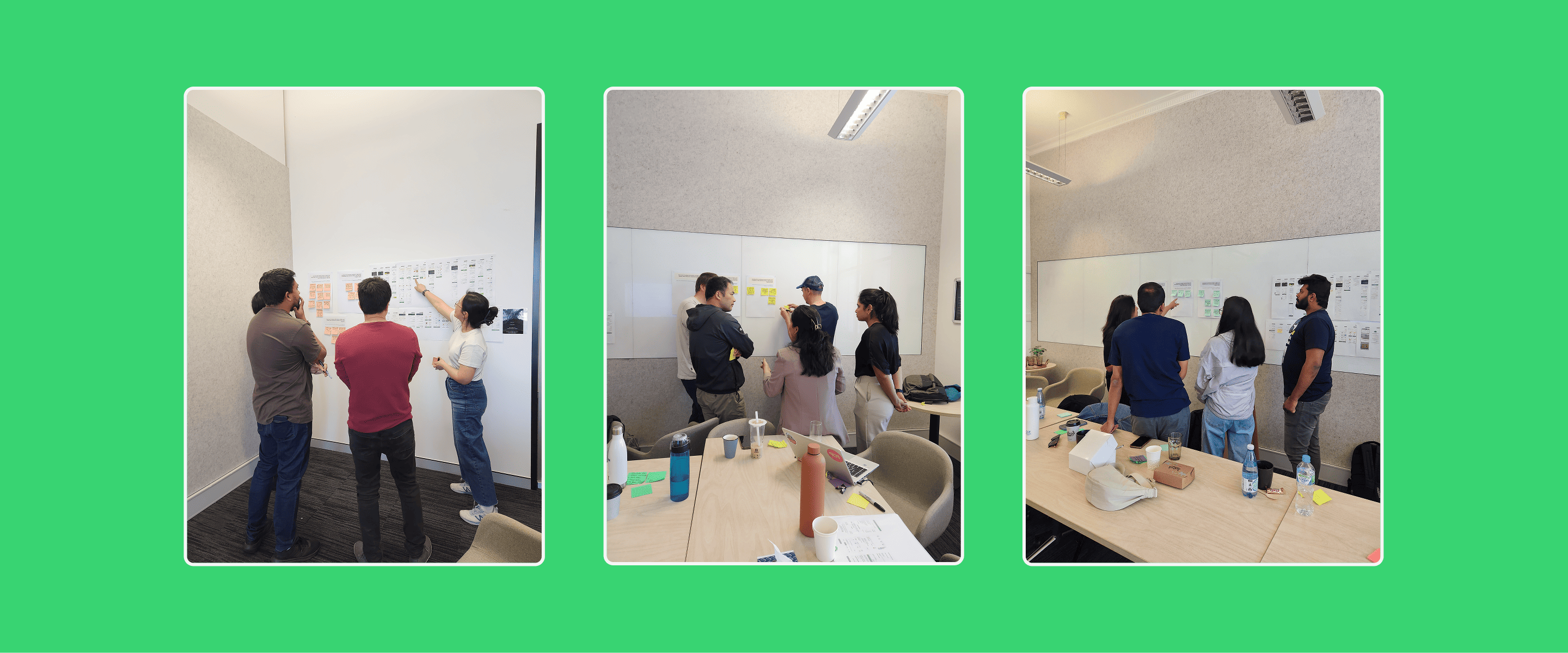
With less than a week to prepare, I was given an opportunity to use our quarterly planning session on anything design related. I thought this was a good opportunity to align with stakeholders, identify opportunities, and ideate on the problem space.
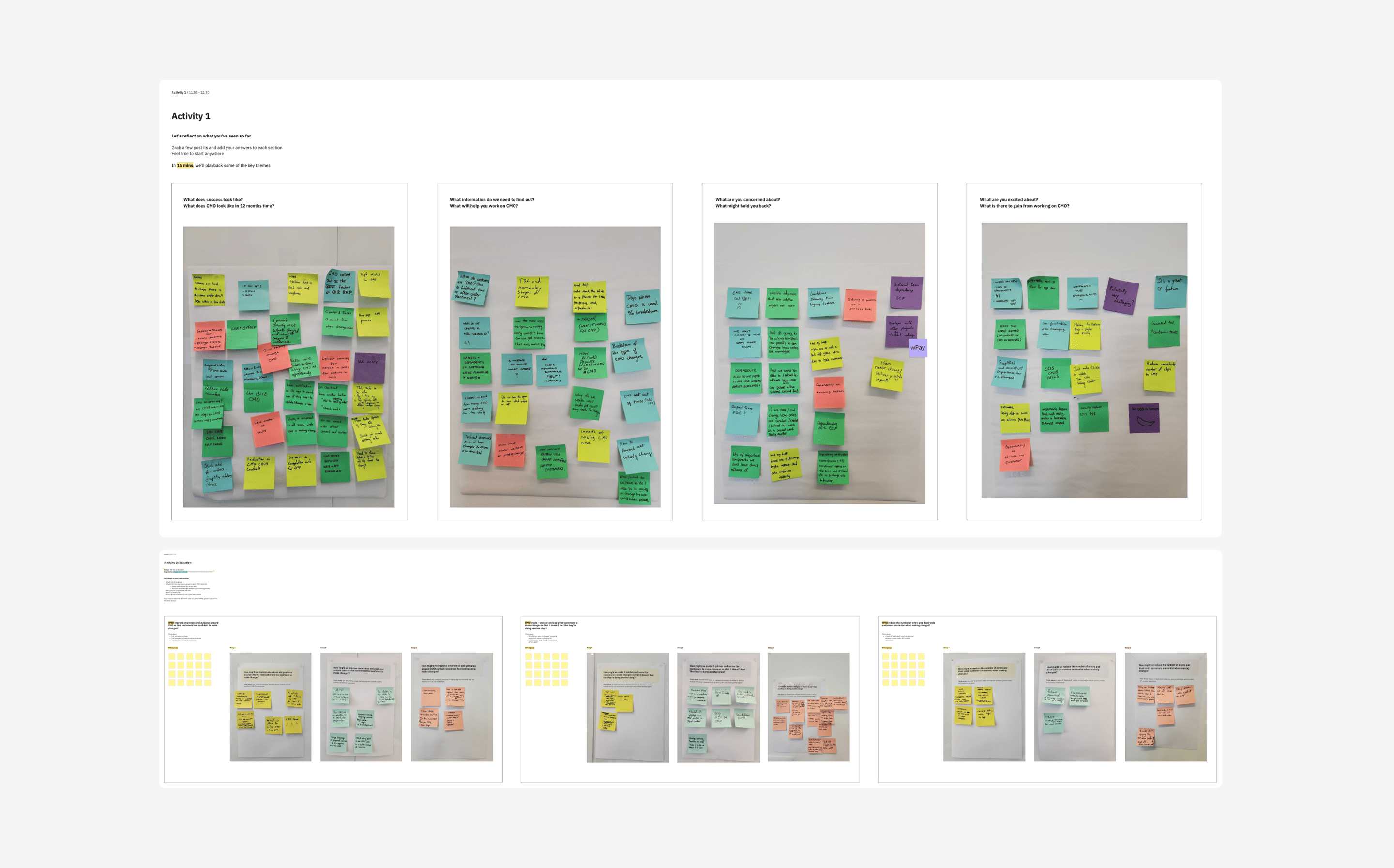
Every big initiative is not without its constraints. As the change order experience essentially touches all parts of the shopping experience, I identified and worked with the following constraints:
Dependencies on other teams
To make changes to most parts of the experience, I needed to engage teams from fulfilment, store operations, ranging, and payments. I worked closely with my Product Manager and Engineering lead to help prioritise changes for backlogs, which was a tough task given teams were at capacity.
Aligning with checkout redesign
In an ideal world, we would complete both initiatives at the same time, creating a consistent end-to-end visual experience. In reality, I had to work with the checkout teams to understand their timelines, what code my team could repurpose (and vice versa) and how to overcome any gaps in the design.
Trader and other system limitations
The scope of technical change was quite narrow as the business is in the process of moving off Trader, meaning I would need to work with my Product Manager to evaluate effort vs value as a lot of work could potentially be throwaway code.
Following the workshop, I identified some technical opportunities that could be immediately fixed, or investigated.
Updating links
The entry point in the order confirmation email was broken, causing friction for over 70K customers.
Updating T&Cs
The current language was perceived as confusing and a deterrent to proceed.
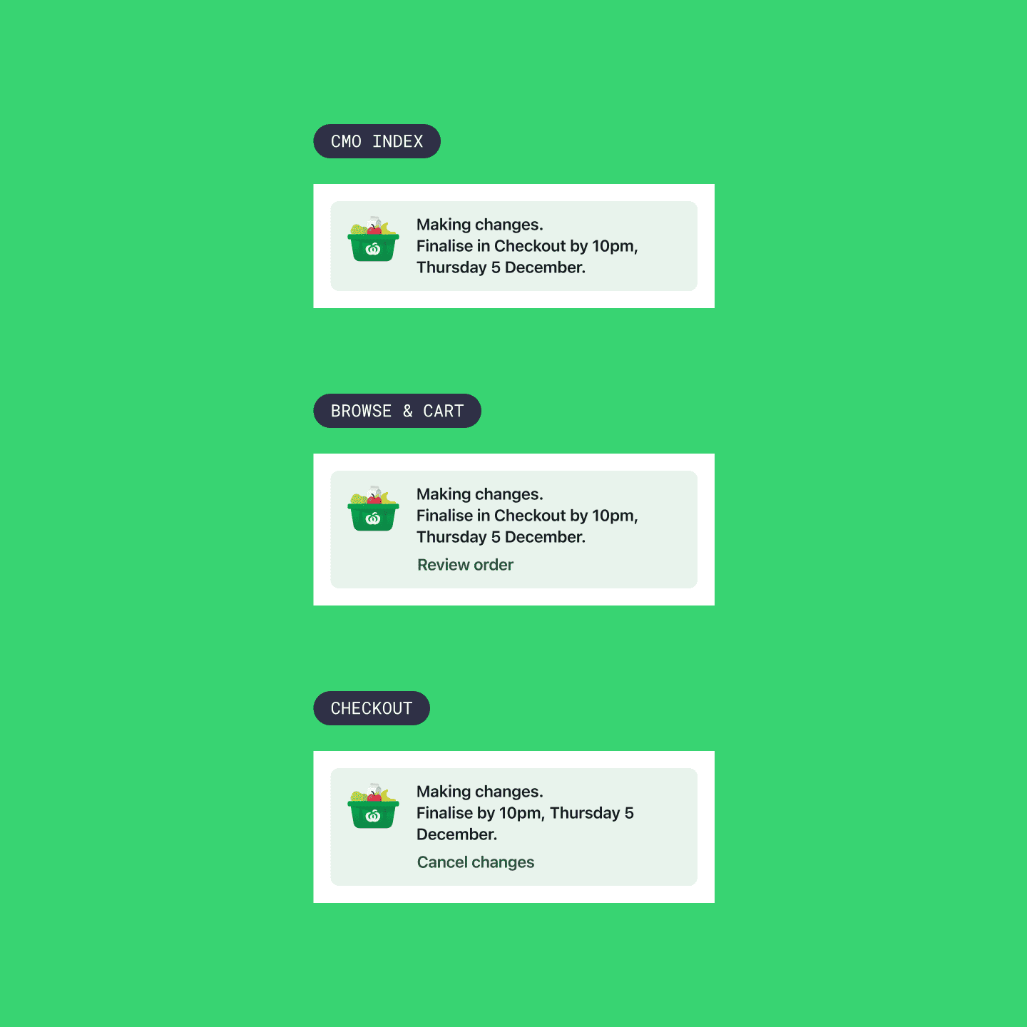
End-to-end change mode banner
At certain points in the current experience, there was no way of knowing the order was in a change state.
Adding production logs
To better understand timeslot availability, I requested my engineers to add logs to capture error data.
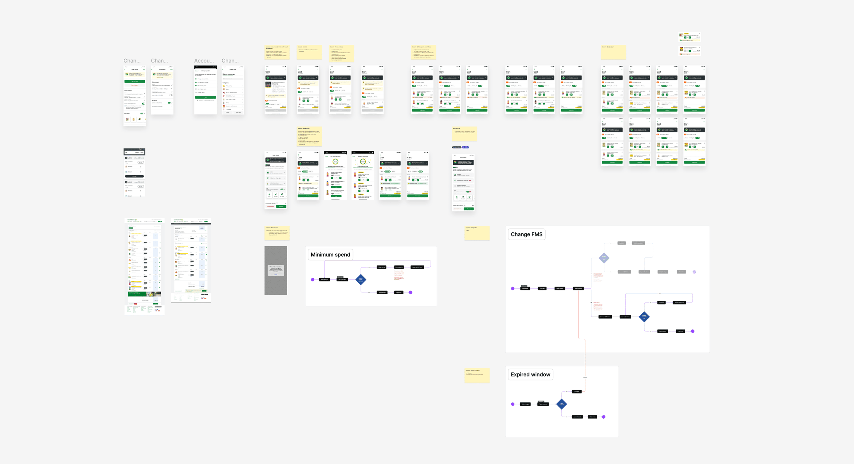
I worked closely with my UI counterpart to ideate on different concepts from the workshop. We went through multiple rounds of feedback with internal stakeholders and other designers to land on concepts we could take into testing.
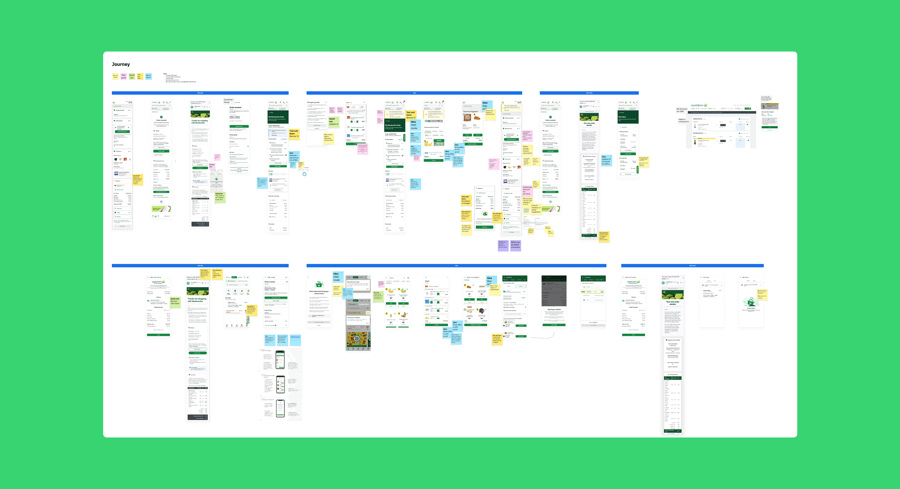
I faciliated customer sessions to validate a change order index concept, comprehension of financial information, and general expectations around the process.
Key insights
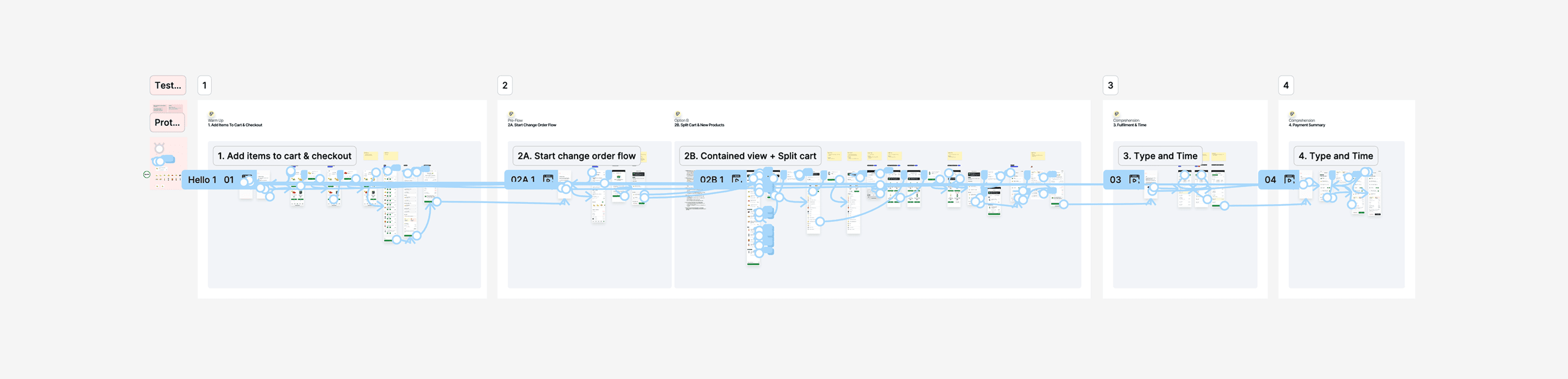
To provide the optimal experience for customers, iterations were made based on customer and internal stakeholder feedback. In conjunction, I worked closely with the engineers to understand any technical constraints with the designs, and to ensure switching between different app views did not feel clunky.
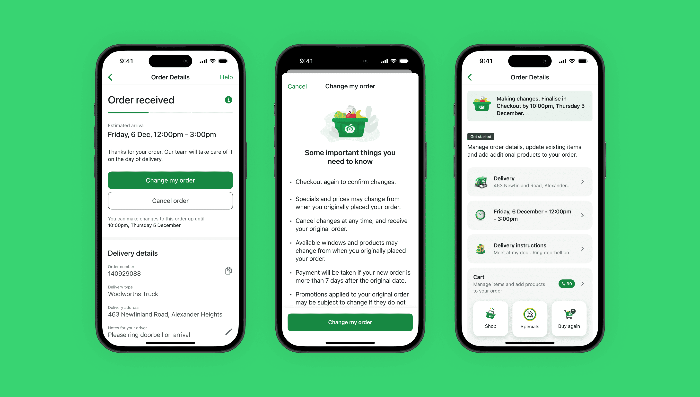
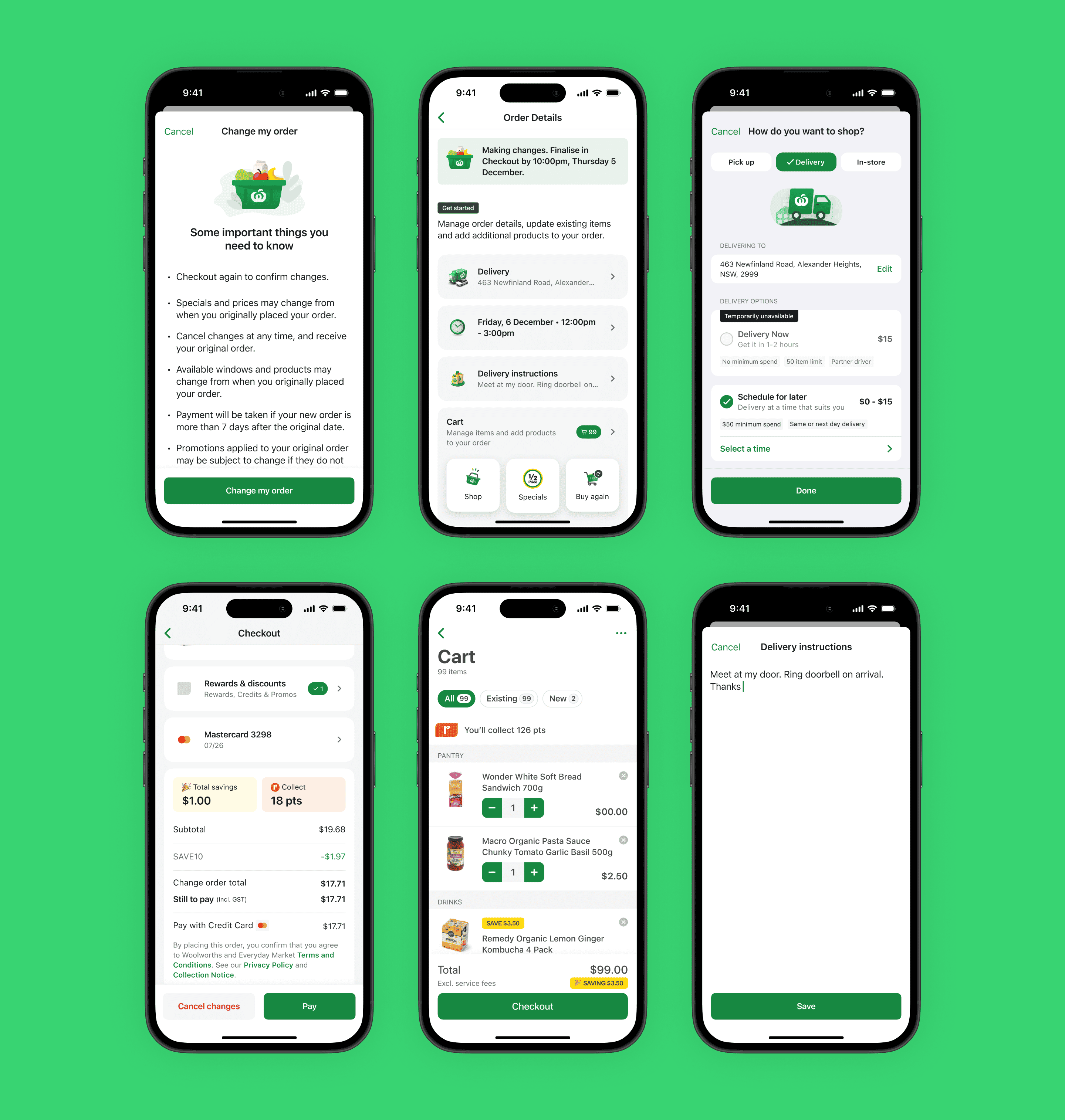
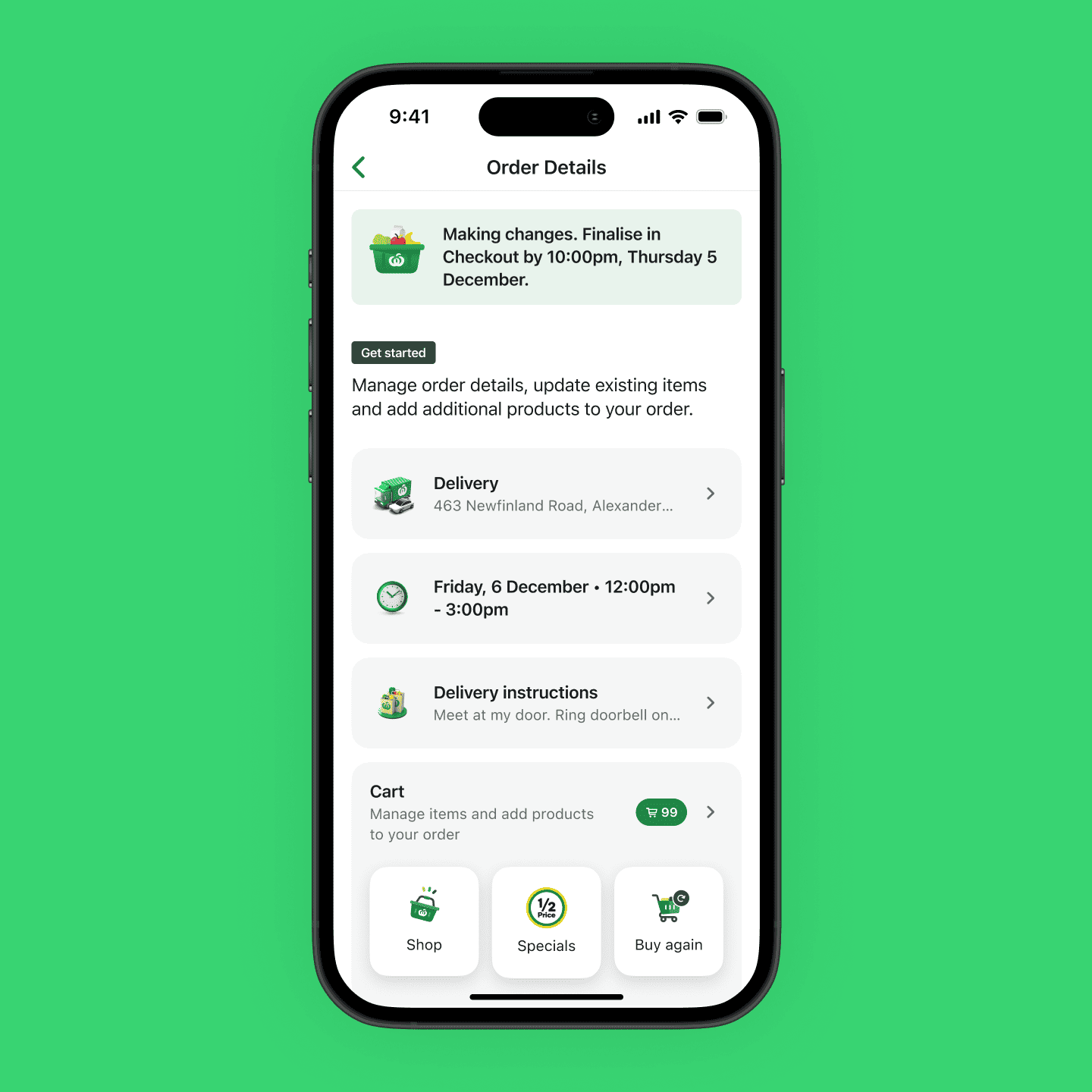
Guiding customers with what they can change in their order.
Customers previously found it confusing and overwhelming being thrown back into the shopping experience to make changes to their order. By introducing a centralised change screen with key entry points to change, customers found it much easier and less overwhelming to make changes.
Making it obvious to customers when they are in change mode. Introducing actions based on which step they are in the journey.
Customers appreciated seeing the banner across the journey as it served as a indicator they were still in the change experience, and a reminder for when they need to complete their changes.
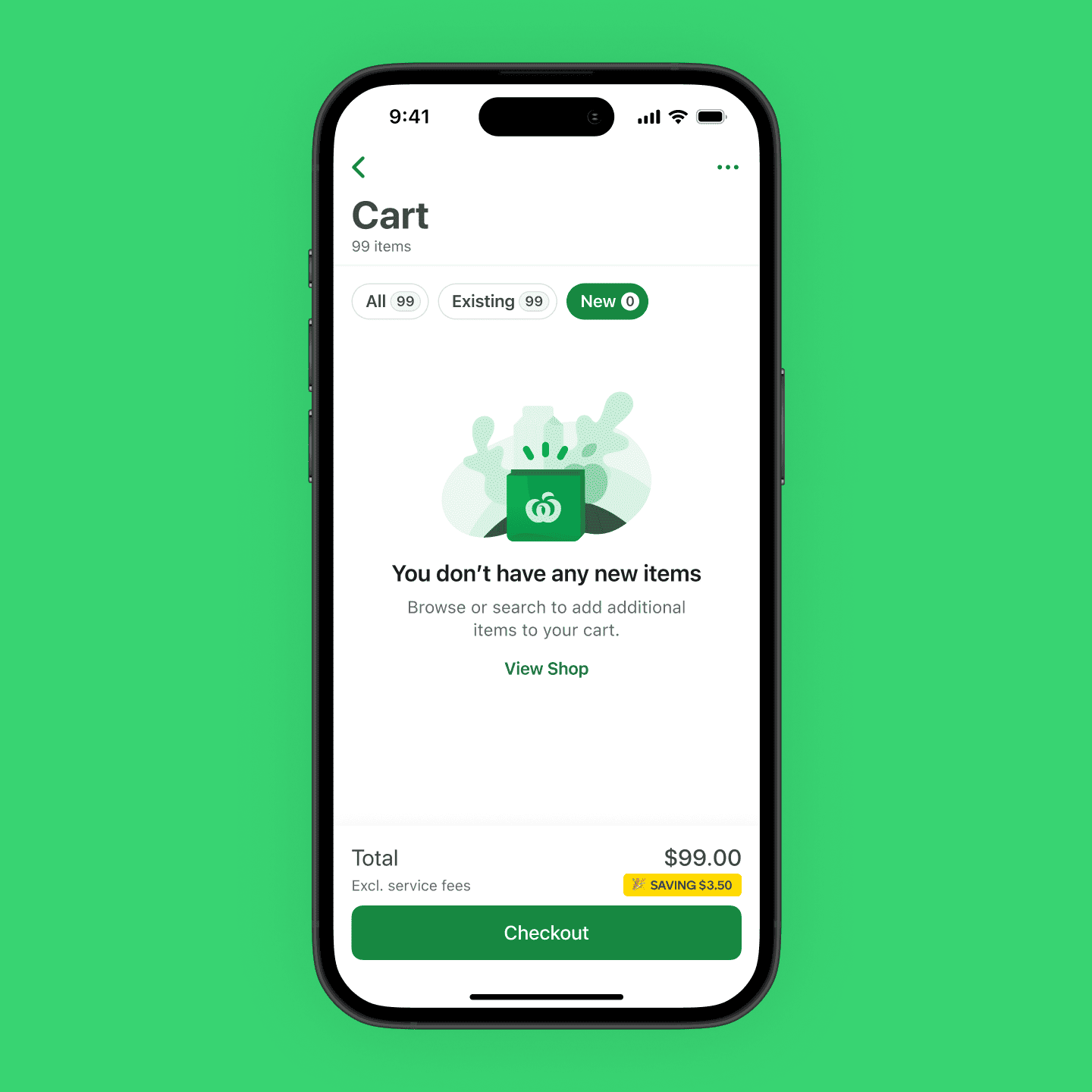
Providing more granularity to changes in their cart.
Due to how the cart was built, products are not added in reverse chronological order and instead are sorted into categories. Customers previously found it hard to keep track of what they have added as part of their changed order, and introducing filtering made it easier for them to differentiate between original and new items.
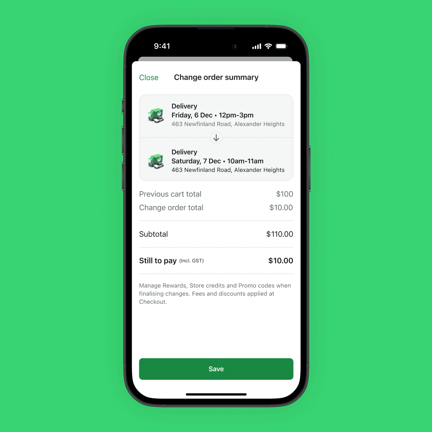
Providing a transparent changelog.
Customers valued the transparency provided through the change summary, as it acted as a form of confirmation ahead of checkout of what changes had been made. In particular, displaying 'Still to pay / To be refunded' made it easier for customers to budget and removed the need to do any calculations.
I'm grateful for this initiative as it meant I had to organise and facilitate my first in-person workshop in a long time (perks of remote working). Keeping 15 stakeholders engaged for an entire day is tiring but rewarding, as it showed how important it is to bring them along on the journey and the benefit of different perspectives.
While this experience is still being built out, I can already see additional areas of improvement that can be fast-follows. A lot of work can be done in the pre-change journey to encourage customers to use this feature, especially for busy shoppers whose grocery needs are constantly changing.
I look forward to seeing how this experience evolves to become a powerful tool for customers, as opposed to a daunting experience.