Helping over 286K customers with considered purchases
A deep dive into improving how customers use complex product, seller and delivery information to help decide whether a product suits their needs.
A deep dive into improving how customers use complex product, seller and delivery information to help decide whether a product suits their needs.
Areas
Strategy, Research, Design
Who
Everyday Market · 2022 - 2023
Tools
FullStory, Adobe Analytics, Askable, UserZoom, Figma
Platform
Web
Yet many potential Everyday Market customers are left uncertain whether a product is suitable, or are unsure of the Everyday Market proposition itself. As such, customers are either abandoning the site for other competitors or accidentally purchase a non-suitable item, both of which result in a cost to the business and its reputation.
With the exponential growth of online shopping and the continual rise of online marketplaces, communicating complex information effectively is pertinent to keep Everyday Market competitive.
Surfacing quality, meaningful and personalised information in an improved hierarchy
increase in add to cart engagement
decrease in PDP bounce rate
increase in VOC scores
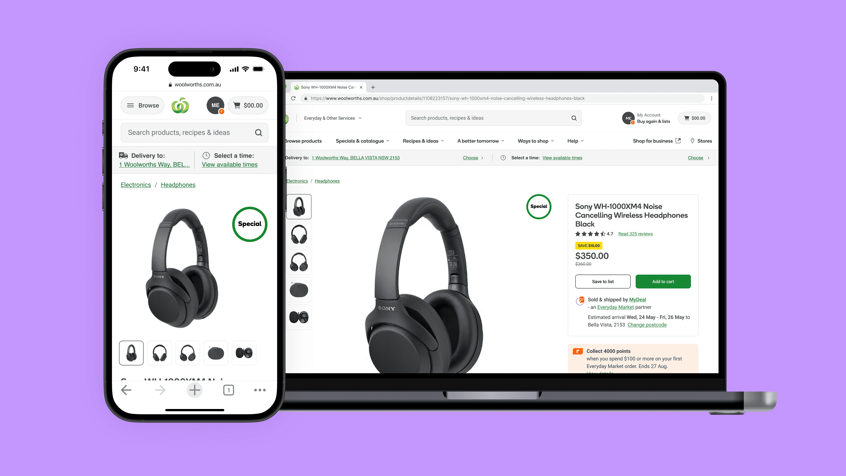
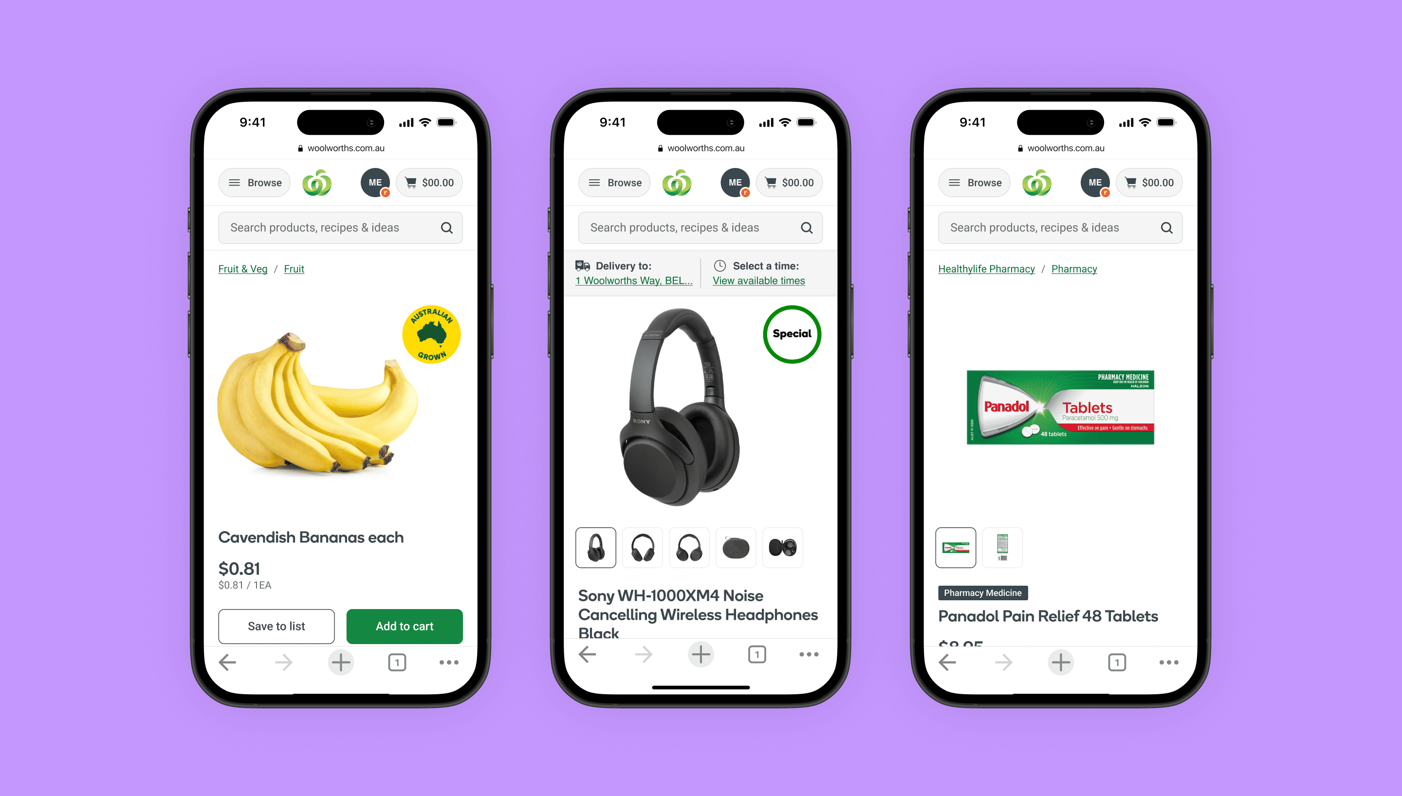
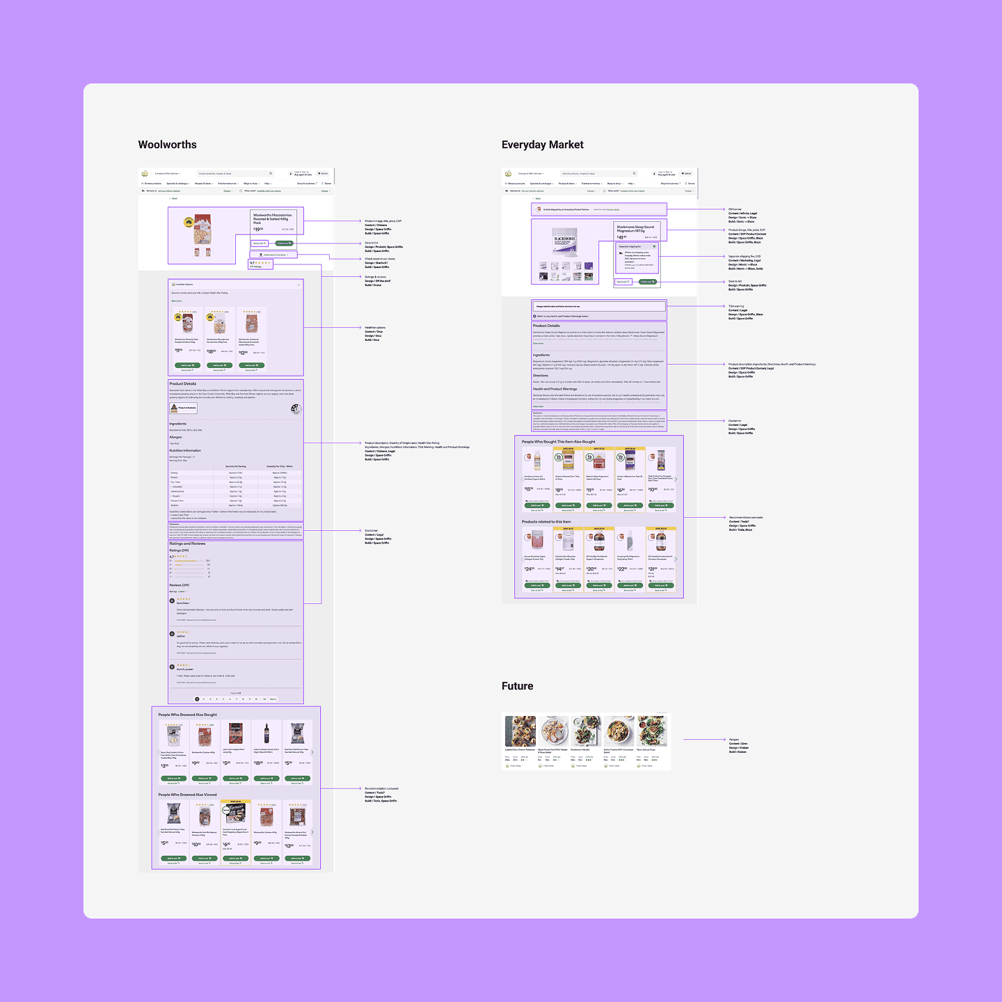
Everyday Market is Woolworths's marketplace offering, introduced in 2021. A key consideration I had to keep front of mind was that while my remit was Everyday Market, our products used the same template as Woolworths - meaning that any change I made for Everyday Market would impact Woolworths products. As such, much of my work involved redesigning the Woolworths product details page as well.
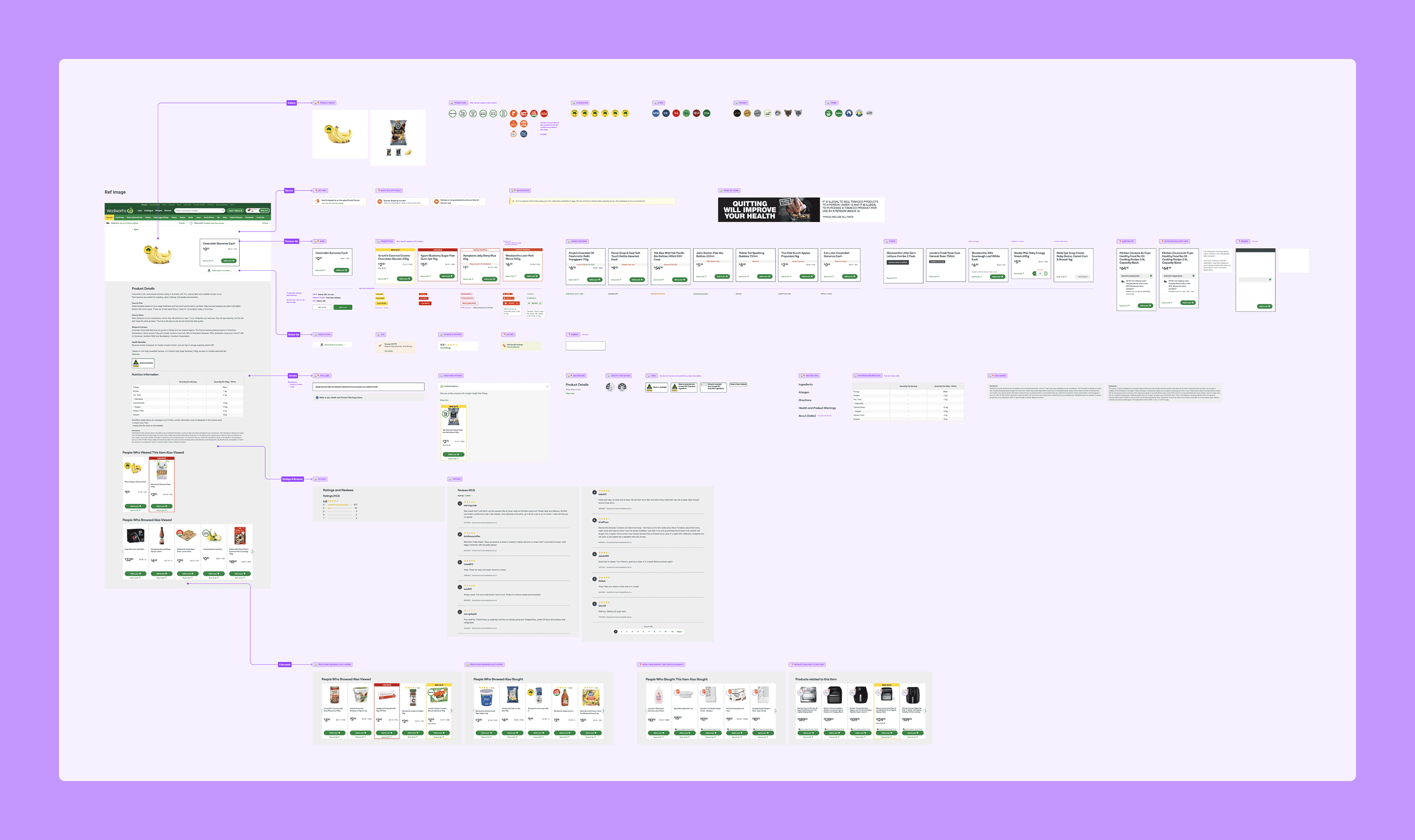
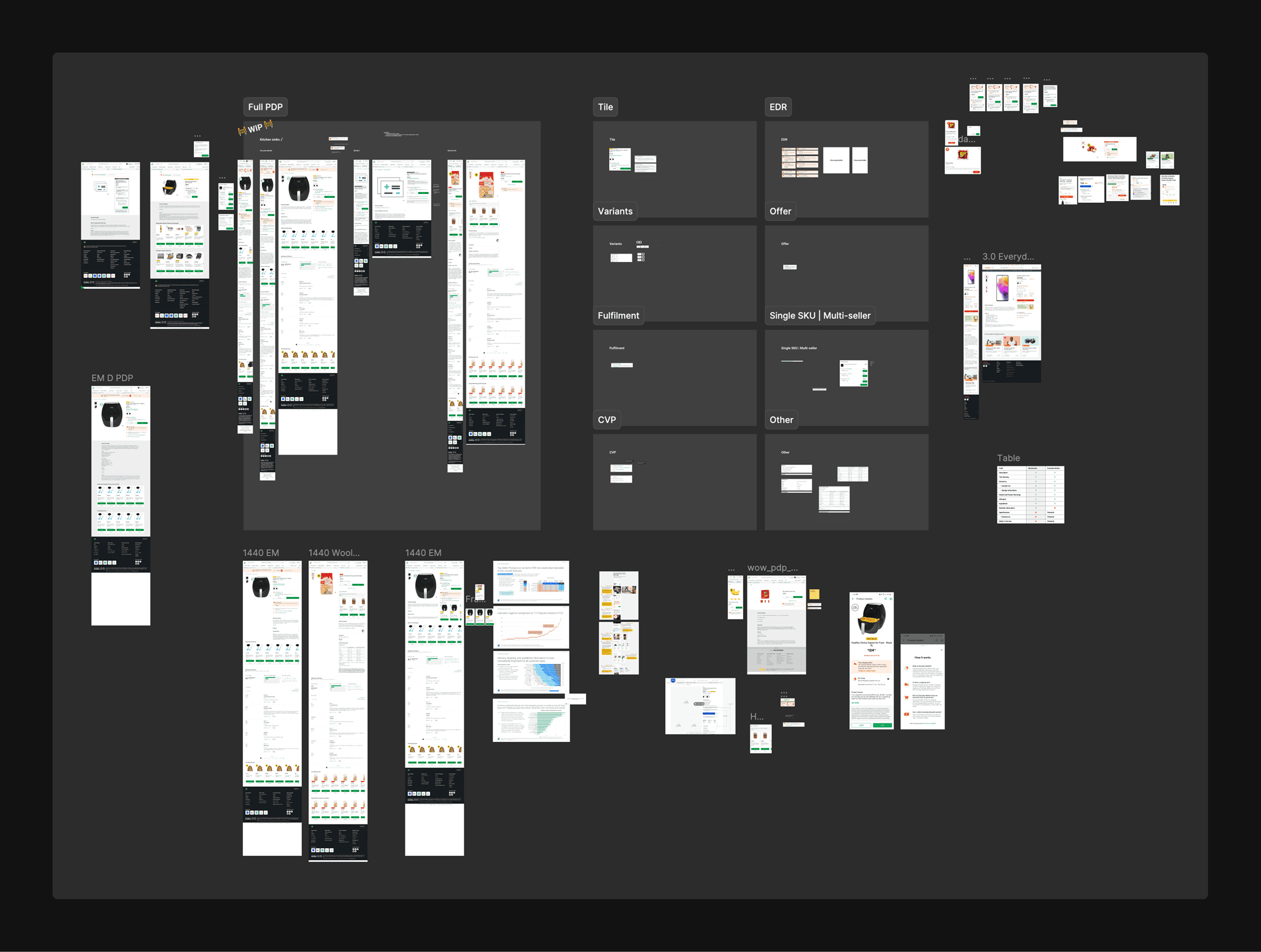
As the product details page had not been touched in years, I wanted to understand all the possible components and assets through two tasks.
Documenting the anatomy
I documented every instance of the gallery, roundels, banners, tile, tags, offers, health information, product information, reviews, and carousel.
Screenreader audit
I conducted a screenreader audit to understand how the current page was structured, and what needed to be improved from an accessibility perspective.
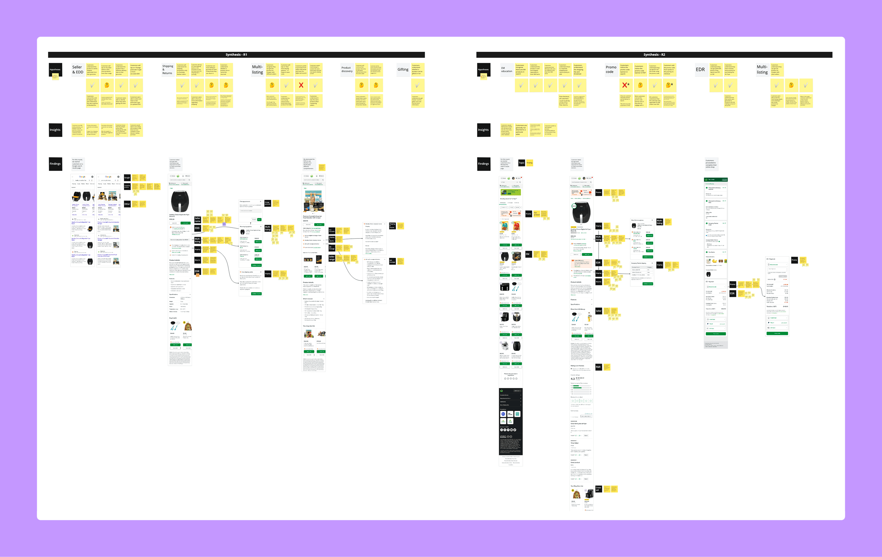
Using mixed methods research, I wanted to understand how customers use the product details page.
Customer interviews
I facilitated interviews with customers to understand how customers use the product details page depending on the type of product, what information was important to them when decision-making, and any immediate gaps that could be identified.
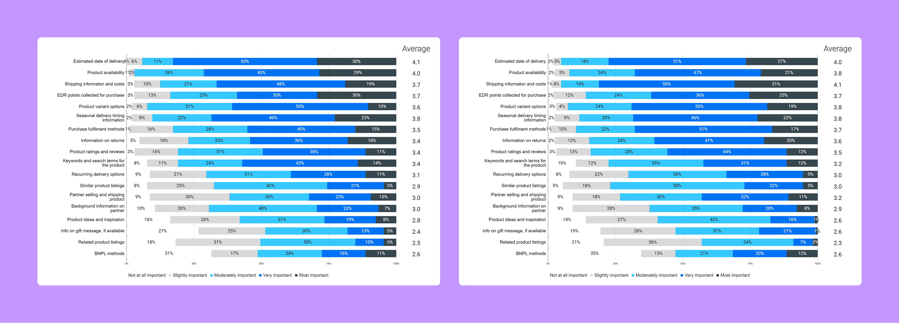
Top tasks quant
I worked with our lead quant researcher to launch a Qualtrics survey to 650 customers to help with ranking and prioritising features.
To complement the primary research I had conducted, I also wanted to understand best practices and what customers would be familiar with among global standards.
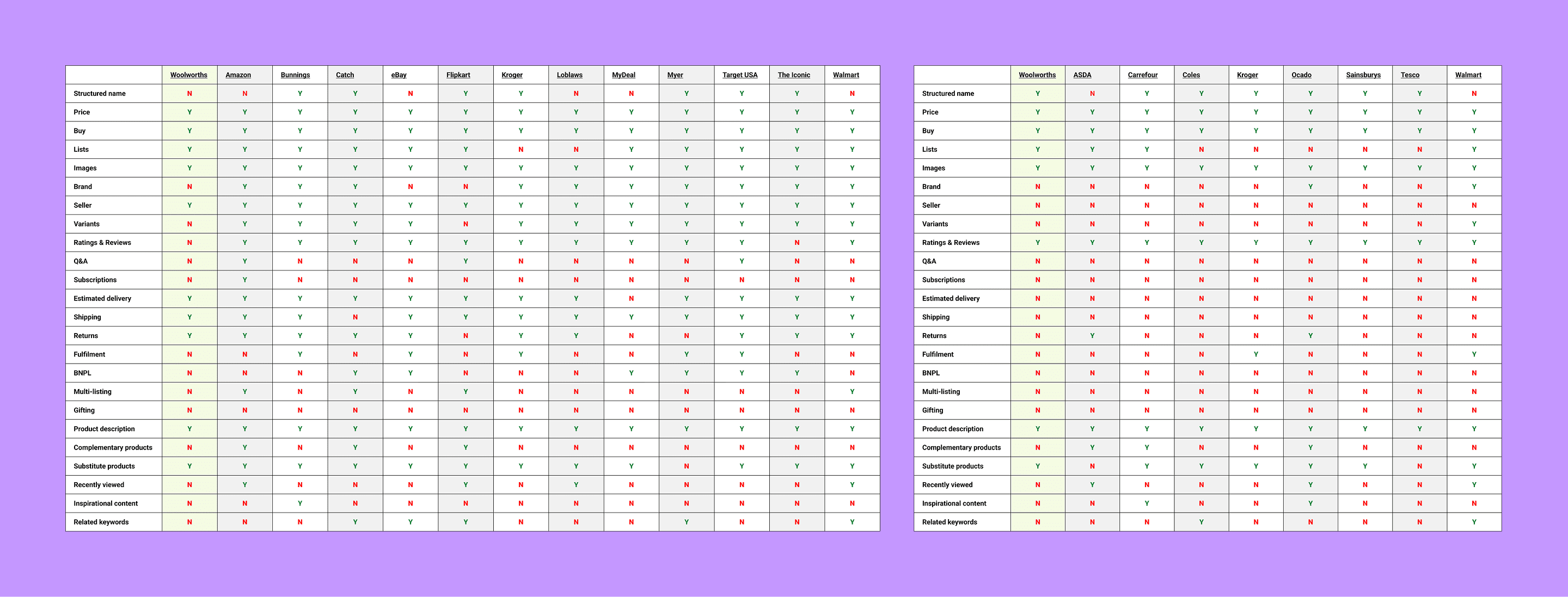
Landscape benchmarking
I analysed 12 websites that supported online marketplace functionality, which was a mix of online-only and hybrid companies based in Australia, USA, India and Canada. I also analysed 8 online supermarkets across Australia, USA and the UK.
Best practice analysis
I leaned on Baymard Institute and Nielsen Norman Group to further understand best practices for product detail pages, to ensure the experience I was creating was intuitive and baseline customer needs, before introducting additional value.
I identified 13 teams that either developed, owned or contributed to a component on the product details page across Woolworths and Everyday Market. After reaching out to an SME from each space, I identified which stakeholders were required as part of the feedback process, as opposed to those who were happy to stay informed.
I worked with my Product Manager to set up a working group that would ensure all relevant stakeholders had the same updates and had a forum to raise any concerns or feedback.
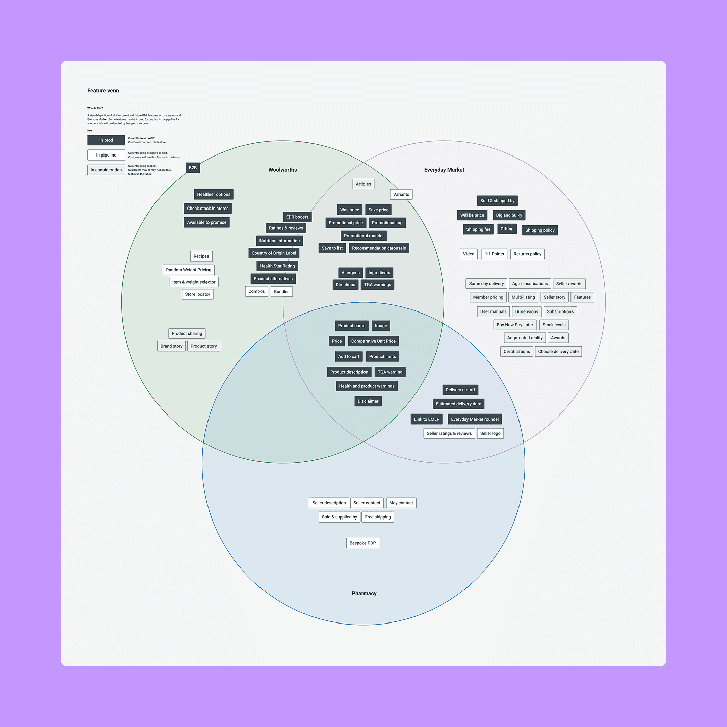
Following speaking to stakeholders, I generated a 'feature venn' to record what features were required by certain teams and products, and similarities between Woolworths and Everyday Market. At the time, there was a project which also had another set of requirements specific to pharmacy products.
To help with decision-making and keeping teams aligned, I use guiding principles to support the north star.
Less is more
Customers make an informed with the perfect amount of information. Avoid visual clutter and consider how customers land on these touchpoints.
It's a shared space
We still sit on green. We work together and share learnings with our Woolworths counterparts so that the experience doesn’t feel disjointed for customers.
Test and learn
We won’t know what truly works until it’s in front of our users. Let’s make informed design decisions and seek to always improve.
Primary tasks
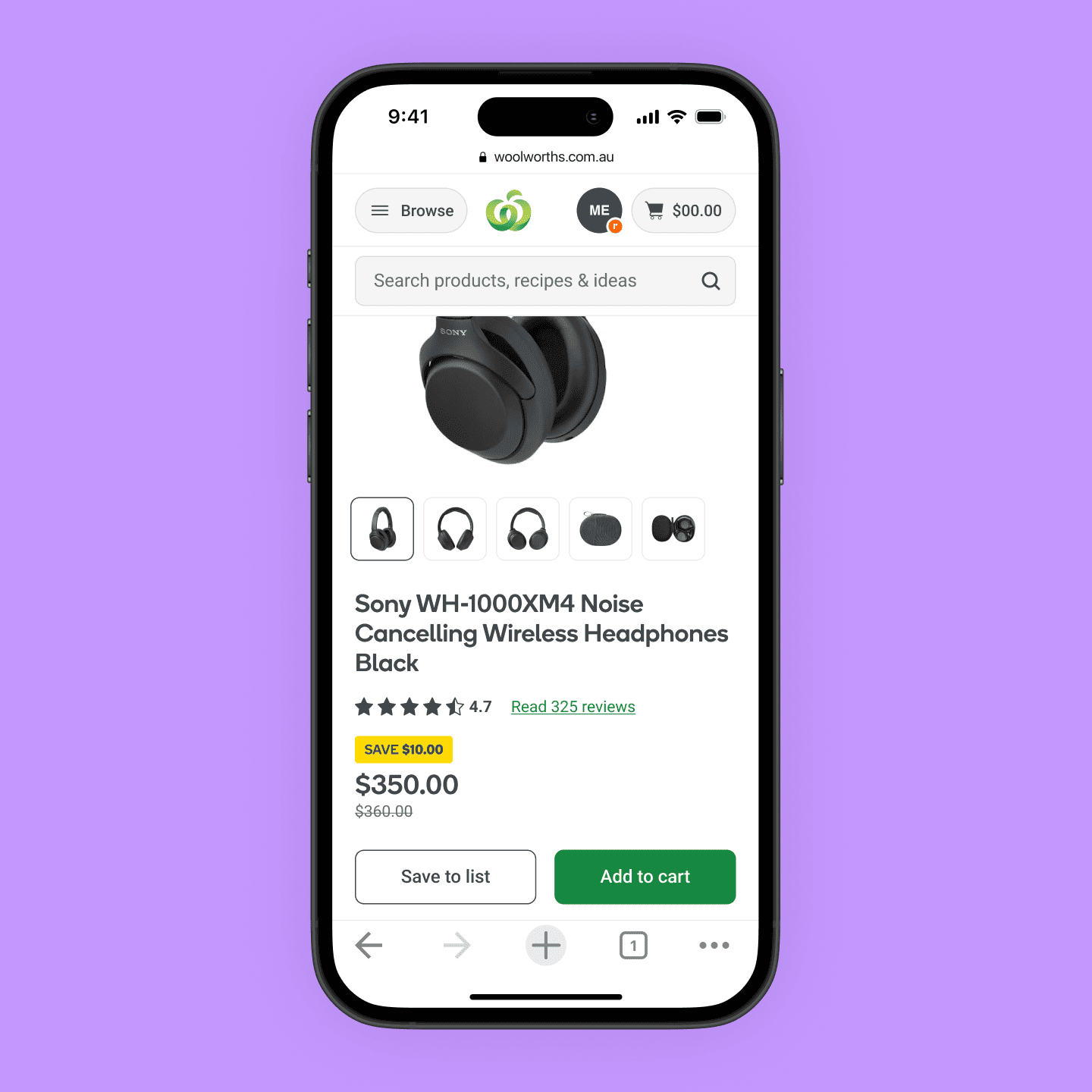
Evaluating product suitability
Using high quality images, product details, ratings and reviews
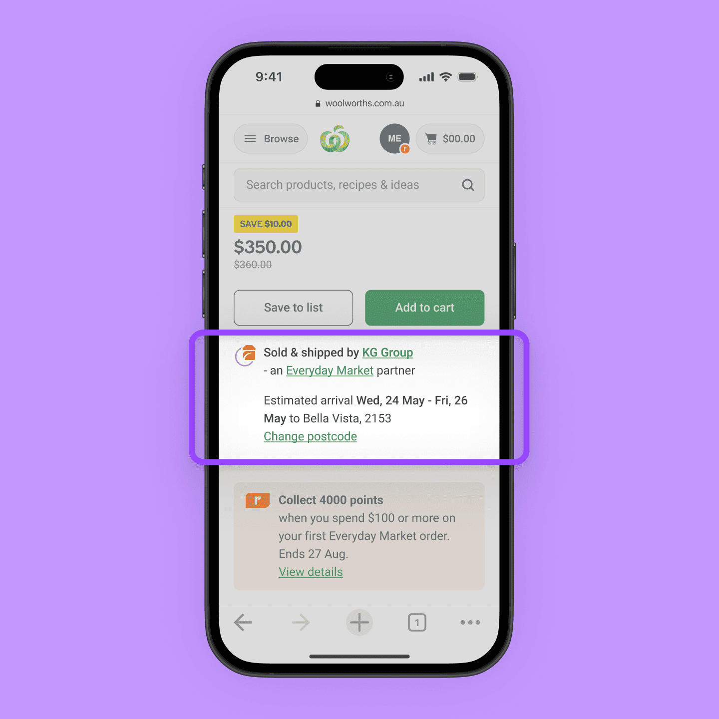
Understanding how to get the product
Looking at shipping and return fees, shipping times, and product availability
Maximising value
Through Everyday Rewards offers, and competitive pricing and deals
Secondary tasks
Discovering new products
Looking at similar products, complementary products, and extended ranges from the seller
Finding inspiration
Through recipes, articles, and product ideas
Following synthesis of all the information, key problems to solve with the redesign emerged.
Banner blindness and lack of hierarchy
Multiple boxes used to convey information are competing with each other, resulting in key information being missed.
Confusing and negatively framed propositions
Customers have a strong online grocery mental model and require extra effort to understand Everyday Market. As customers also compare considered purchases across sites, the confusing proposition is seen as a deterrent.
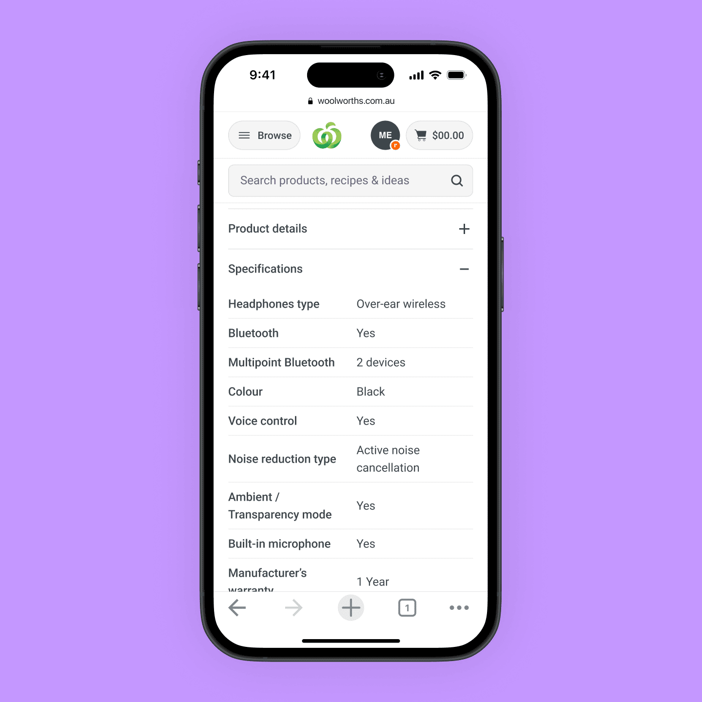
Product details can be inconsistent and lack structure
Customers understand and compare products using product details, yet Everyday Market products contain blocks of dense text.
Lack of social proof
Customers rely on ratings and reviews when looking at considered purchases to help build their understanding of product suitability, yet Everyday Market does not support this functionality.
Lack of scalability
The page does not scale with growing business needs, as evidenced by needing to create bespoke components to show information.
There were two key areas to ideate on before introducing new features: (1) the base grid layout, and (2) the hierarchy of content.
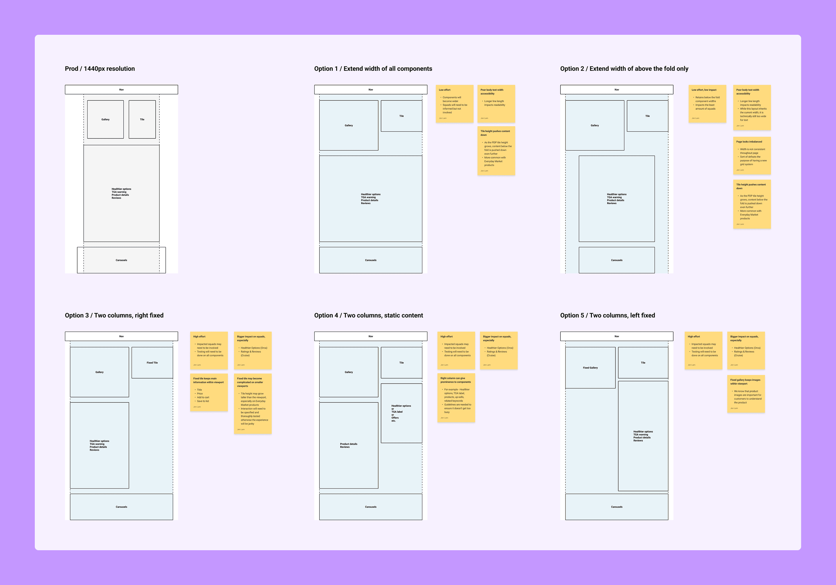
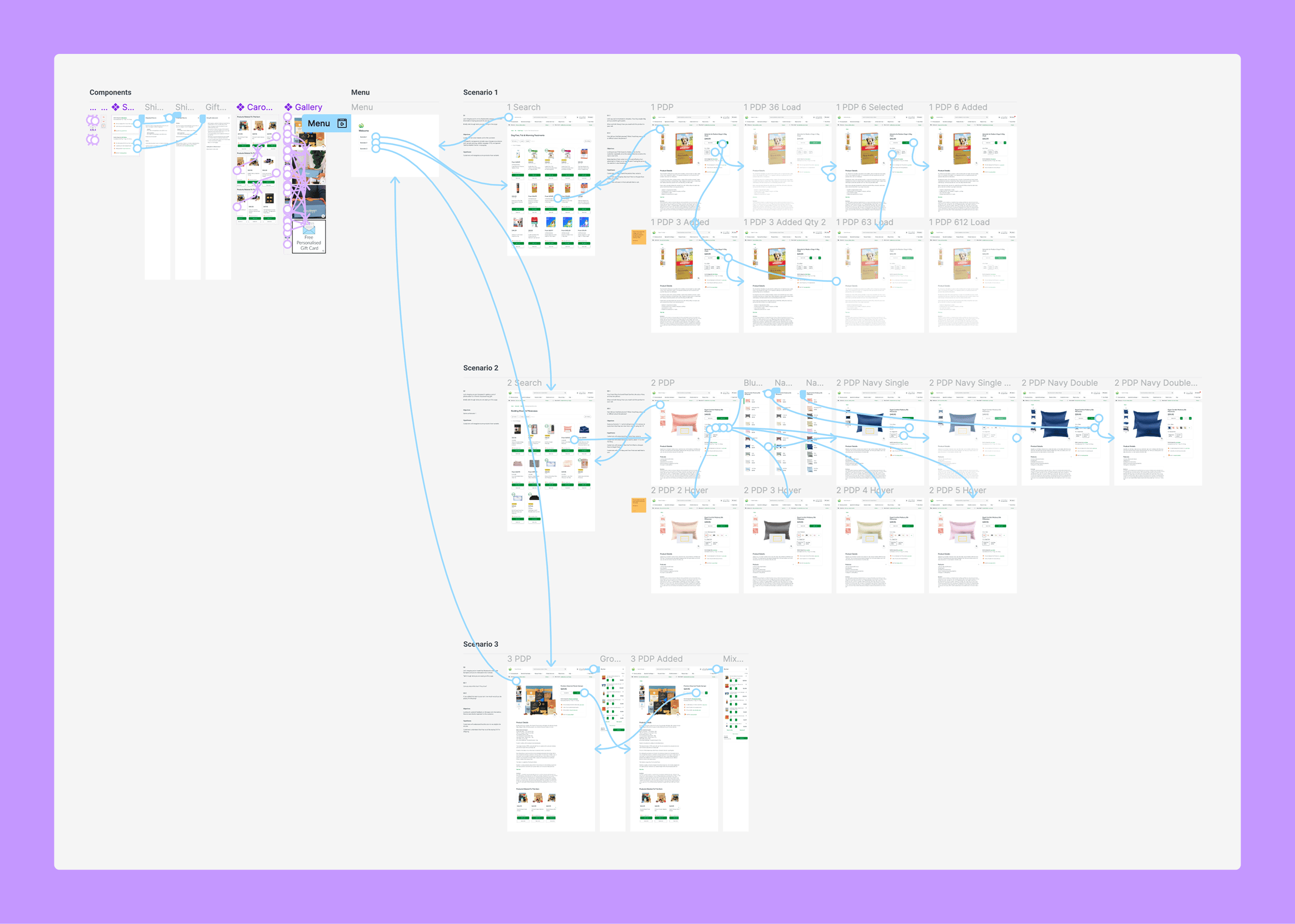
I facilitated multiple rounds of usability testing, with each round having a strong focus on a particular section of the page. All up, I spoke to 25 customers across mobile and desktop, and also conducted unmoderated testing with a further 20 customers.
Sticky problems that required multiple iterations
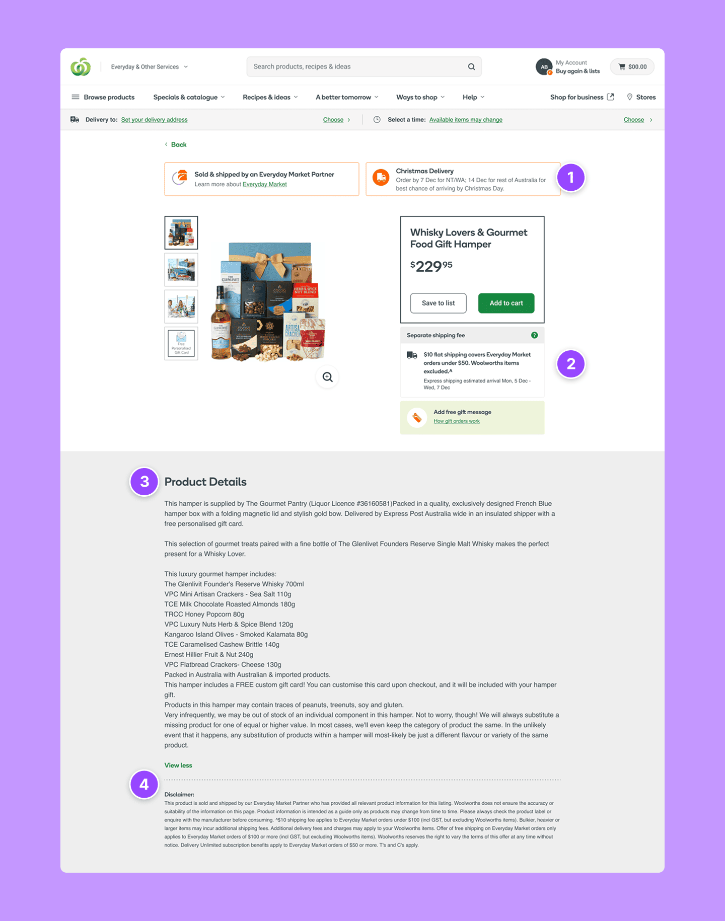
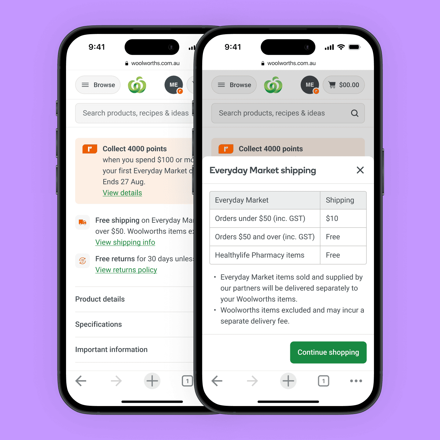
Shipping proposition
It was hard to land the shipping proposition, as customers weren't used to separate fees from their groceries. Customers became more confused as more copy was introduced, so the final version that tested well was a stripped back matrix.
Multi-variants
For some products, the price would change as different variants were selected. Some customers didn't notice the price changing out of the viewport, so I introduced dynamic pricing on the last variant type.
Product carousels
I had to balance the business's need of upselling products, with the customer's need to understand more about the product. I tested multiple variations of the placement, and actually resorted to an experiment in production to get real data engagement and bounce rate.
Another challenge I ran into was constantly changing priorities throughout the business. As the base template was owned by another team that had higher priorities, I had to work with my Product Manager and Engineering Lead to understand what changes we could make and any areas our developers needed to upskill in. To better prioritise work, I broke the design down into smaller deliverables.
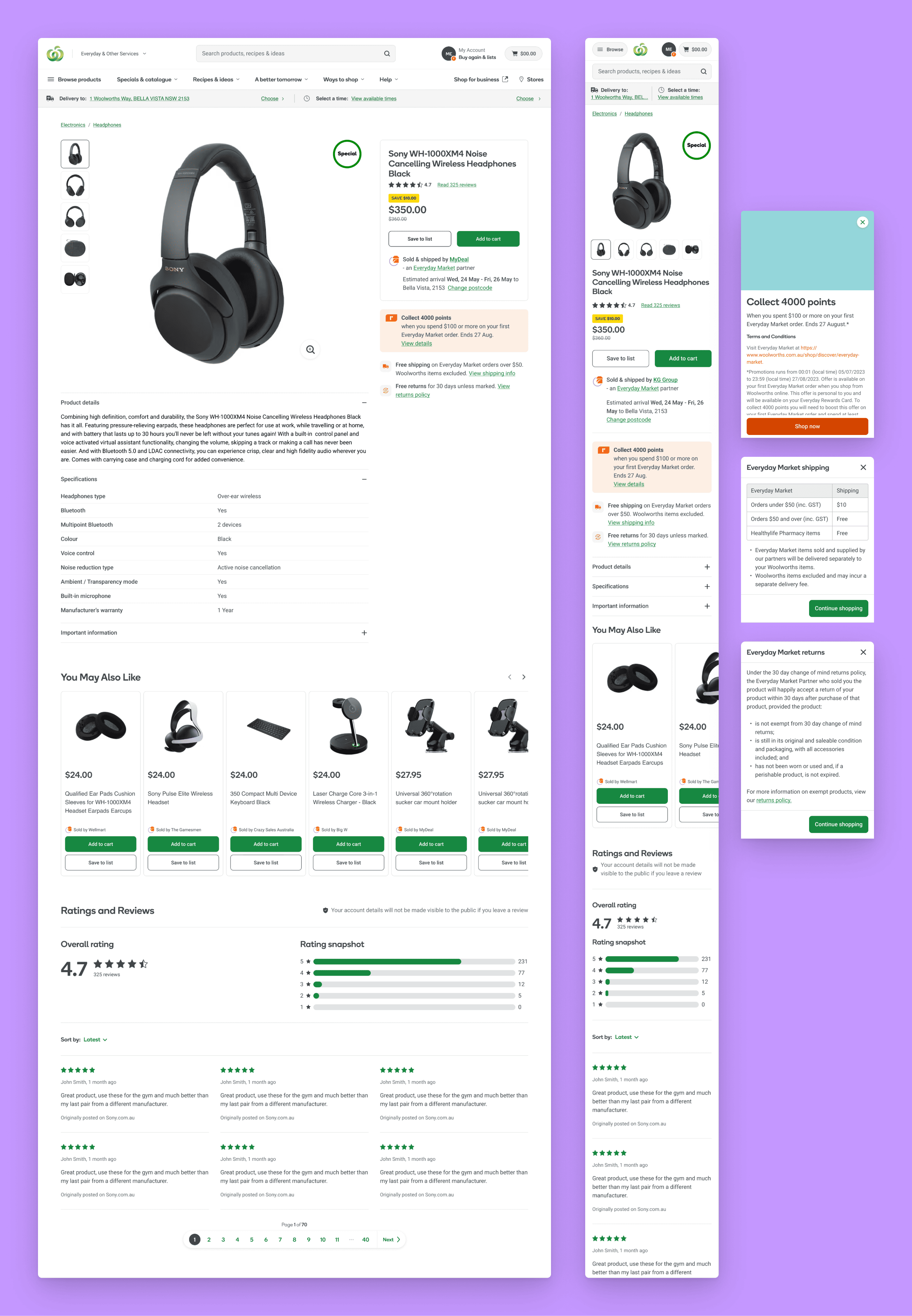
Product tile equivalent elements
Primary task addressed: Evaluating product suitability, Maximising value
How (seller) and when (estimated delivery date) the customer is getting the product
Primary task addressed: Understanding how to get the product
The benefits of Everyday Market for customers
Primary task addressed: Maximising value, Understanding how to get the product
Details of the product, input by Brand, Supplier or Seller
Primary task addressed: Evaluating product suitability
I appreciated being given the space to go deep in discovery with this initiative. The anatomy exercise was useful for me to refer back to and create a scalable design, but also to demonstrate to stakeholders that we can't just go ahead and change something without considering the impact to other instances.
One thing I hope to continue to improve is how I manage dependencies when priorities for those teams change. While I was able to break the development into parts, I know it's not as easy for other projects.