Creating a quantity selector design system component
How I contributed to the Woolworths Group Design System, supporting designers and developers.
How I contributed to the Woolworths Group Design System, supporting designers and developers.
Areas
Design systems
Who
CORE · 2023
Tools
Figma, Notion
Platform
iOS, Android, Web
The design system team at WooliesX were looking to crowdsource the component build and documentation process to increase the rate of releases. I volunteered with another designer to contribute the quantity selector component.
These components would be used across Woolworths Group banners - Woolworths, Everyday and Big W - across 53 teams consisting of designers and developers.
Audit existing best practices and component instances across Woolworths Group banners
Synthesis of findings to inform what is required for component build and documentation
Component build in Figma following any necessary ideation and battle testing
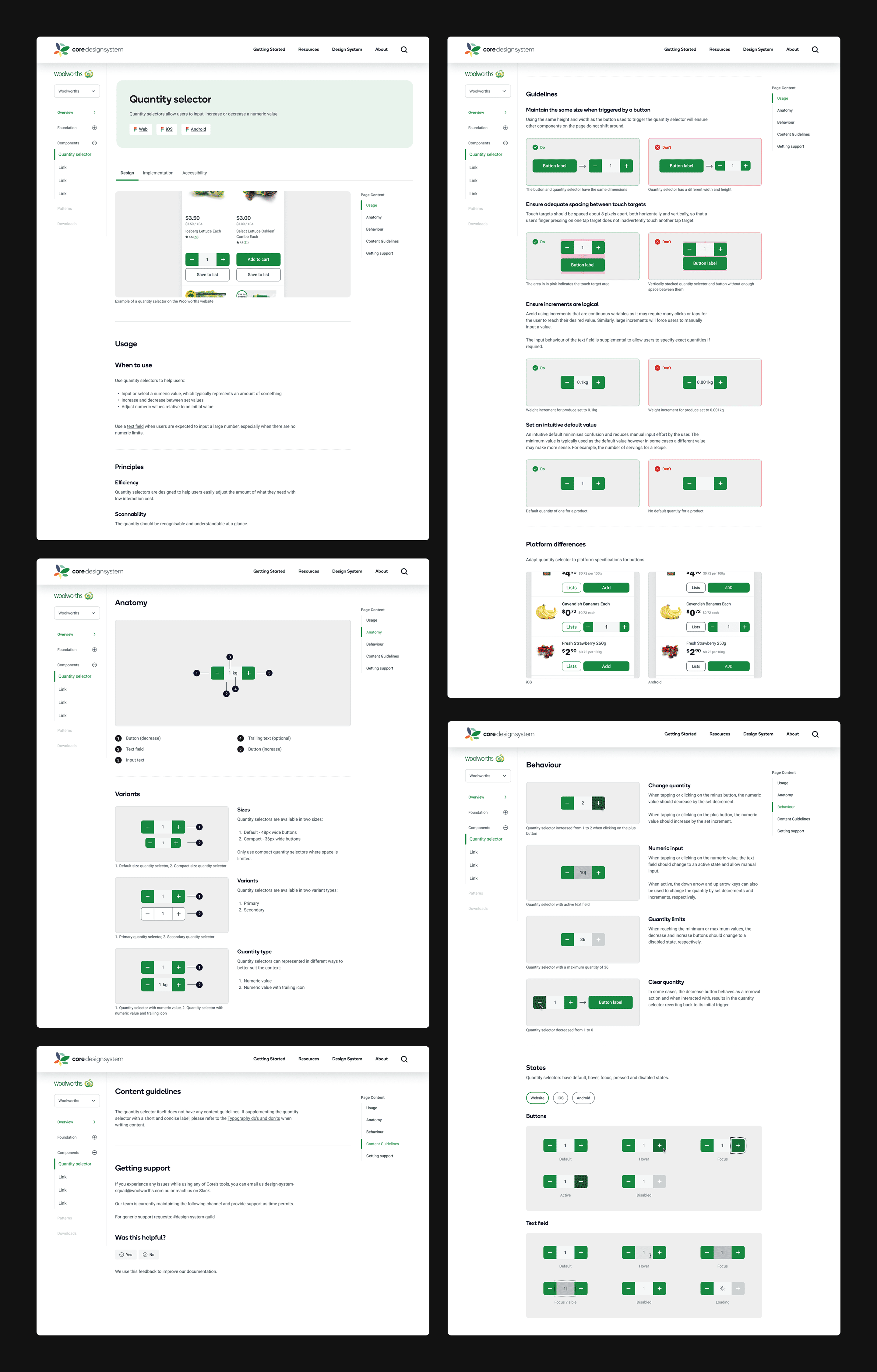
Documentation of component usage, anatomy, behaviour, and content guidelines
Handover to developers to build in Storybook
To form an understanding of the component, I researched best practices and existing types of quantity selectors in other design systems.
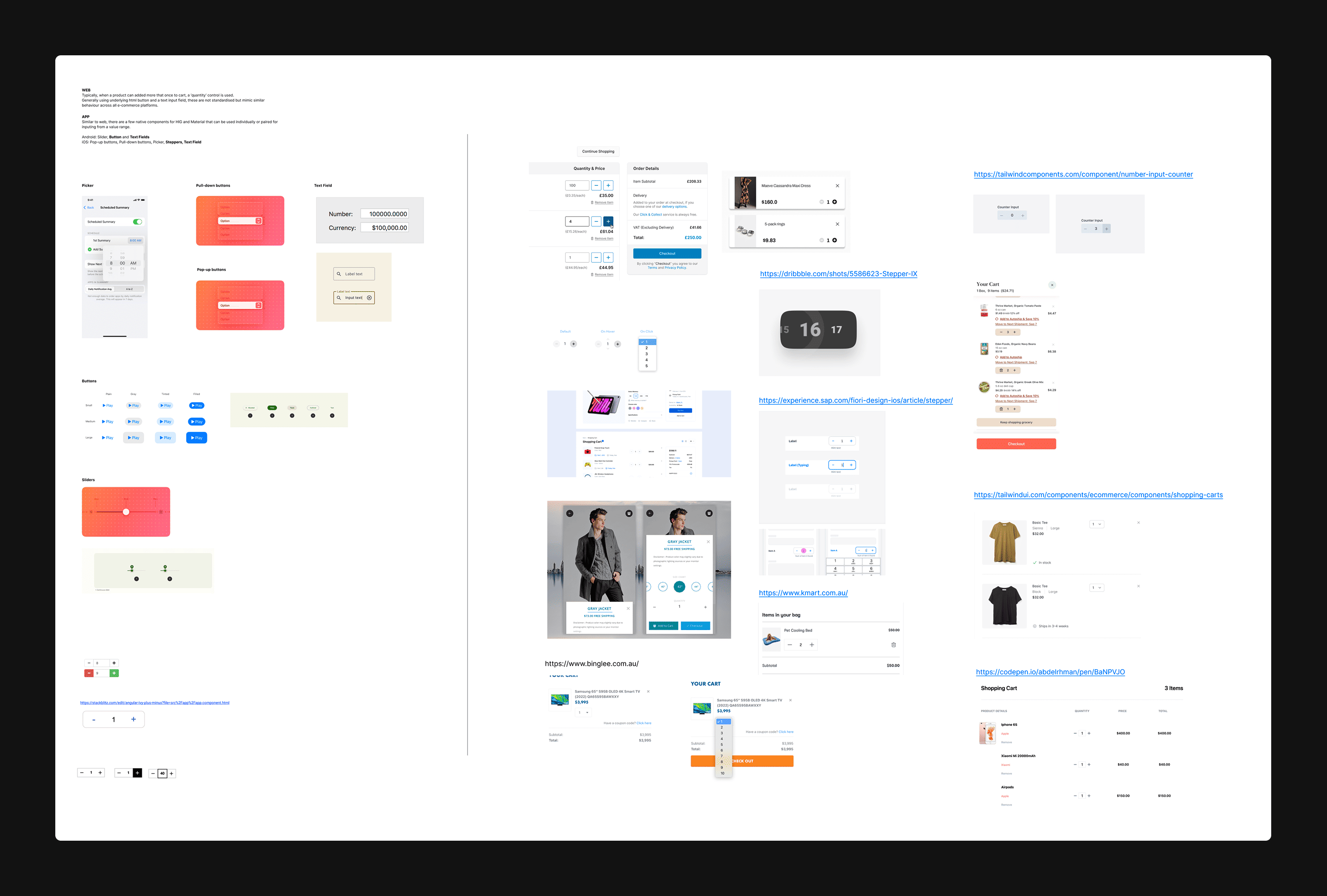
To ensure the component could be used across banners, I conducted an audit of all the existing quantity selectors across web, iOS and Android.
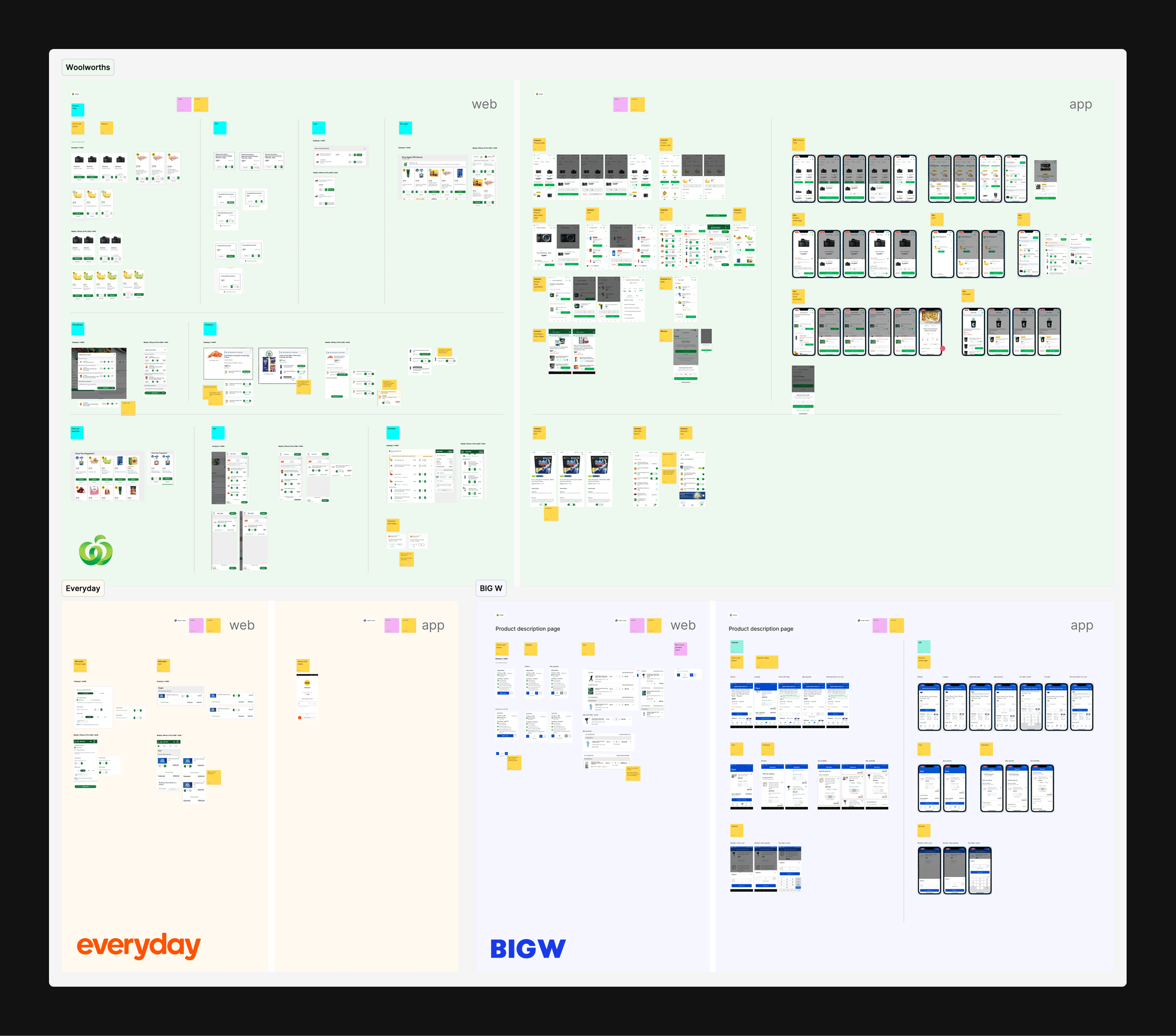
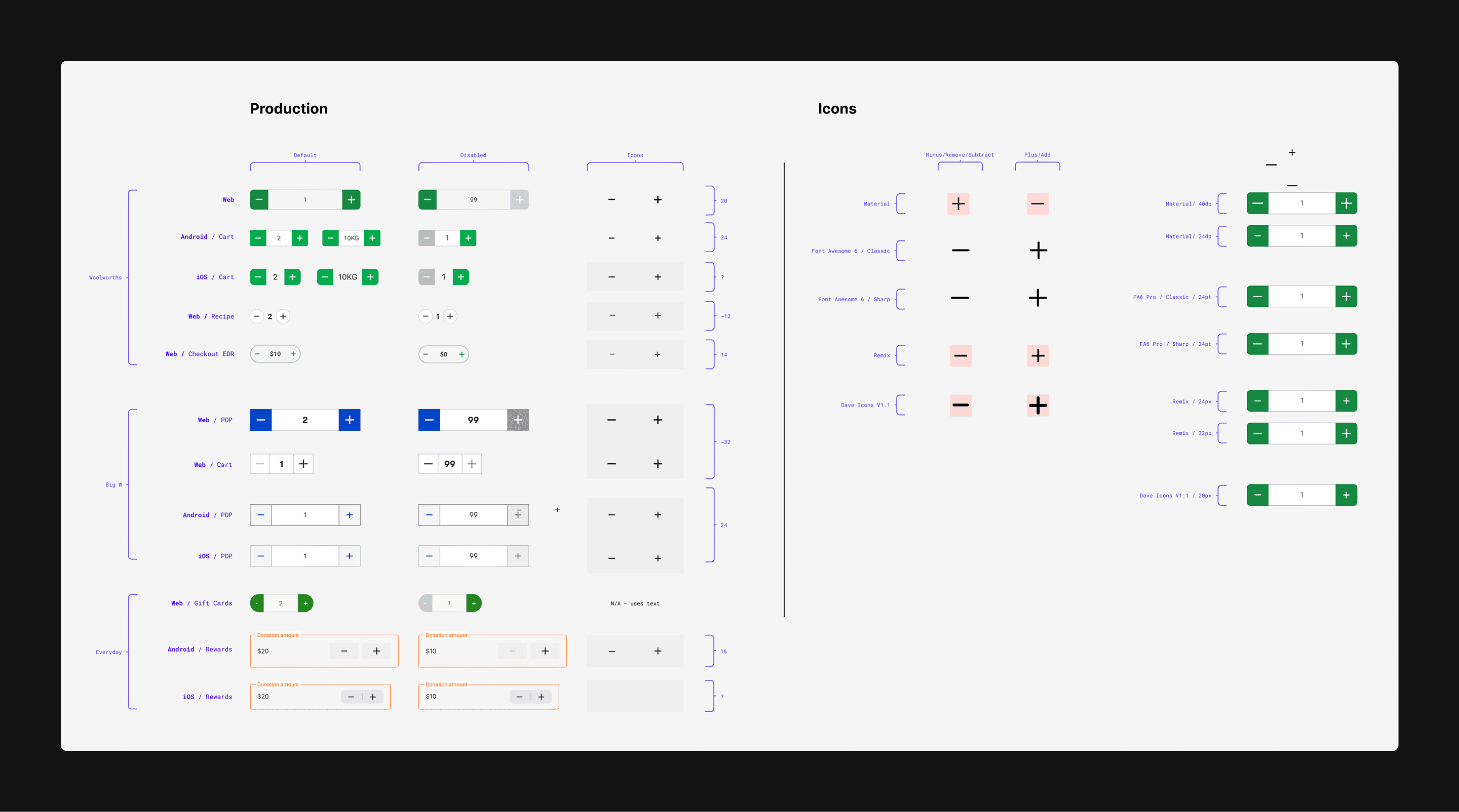
Following the audit, I created a quick matrix of all the quantity selector components used across the banners and noted any discrepancies or considerations when creating the component.
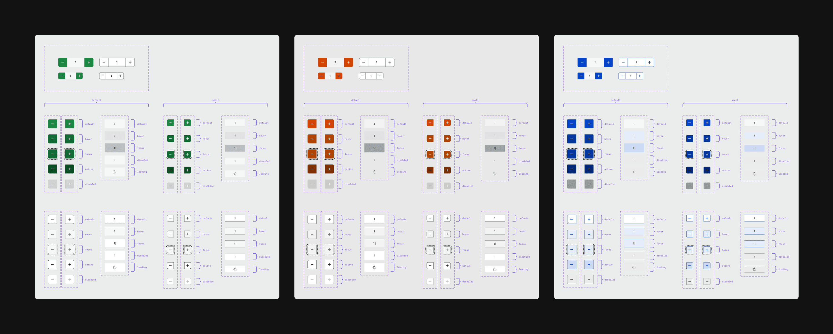
After ideating to reach a banner-agnostic design and sharing with other designers for feedback, I created each variant and state of the quantity selector. It was battle tested to ensure all combinations worked within different designs.
Using the design system template, I drafted up content on how to use the quantity selector component. As part of this process, I worked closely with the design system team to ensure the tone was consistent with other component documentation.